
A subscriber to Cornwall Alliance’s e-newsletter recently wrote asking us if we have replies to the various graphs at “Climate Change: Global Temperature,” on the National Oceanic and Atmospheric Administration’s (NOAA) Climate.gov web page.
Oh my goodness the misrepresentations of facts in those graphs are awful!
Preparing refutations/analyses of all the graphs there would be a very long and complex project for which I simply cannot take time. But let’s take this one—probably the most iconic—for starters (and charitably ignore the fact that the graph is mislabeled as “Global Average Temperature” when it should be “Global Average Temperature Anomaly,” that is, it shows not the actual temperature but the divergence of the temperature from the 20th-century average):
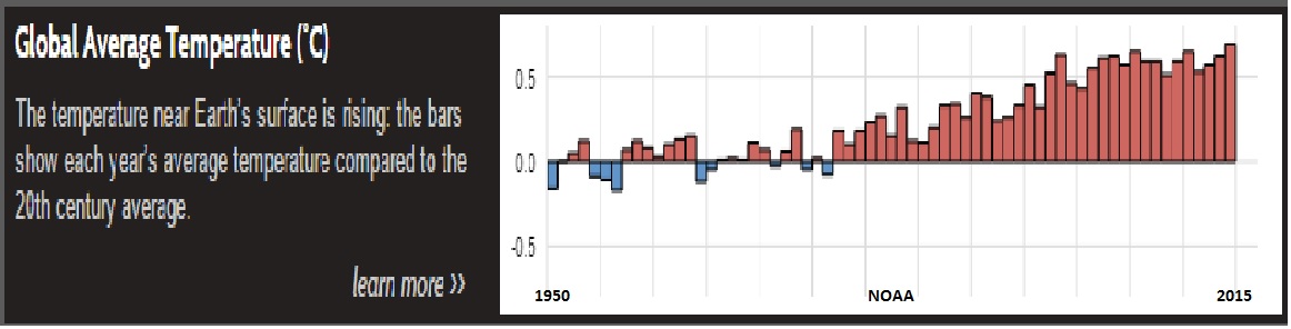
(Sorry for the fuzziness of the graph. To see it more clearly, click here.) This certainly gives the impression of a precipitous increase in temperature from 1950–2014 (the period covered)! That’s the effect of limiting the perpendicular axis to such narrow scope.
Veteran observers will note that the entire range is only 0.9˚C (from -0.2˚C in 1950 and 1956, to {allegedly [more about this in a moment]} +0.7˚C in 2014), but even they will be hard pressed to suppress the psychological impact of the graphic depiction: cool, pleasant blue for the below-average temperatures, ominous red for the above-average temperatures.
And even those learned observers will be even harder pressed to remember that there is absolutely no scientific basis for the claim that “average” here is any better for the world than any of the above-average (or for that matter below-average) readings.
The fact is that even if we concede the temperature claims behind the graph (that is, if we ignore the strong evidence that NASA and NOAA have tampered with temperature data in ways that exaggerate apparent warming over the period), the range depicted is so small as to have no significant effect on human or other life on Earth.
I’ll illustrate that with this chart, sent me by MIT Emeritus Professor of Climatology Dr. Richard S. Lindzen, from the weather page of the Boston Globe published March 12, 2013 (any other date would serve as well—the Globe prints this chart, updated, regularly), which shows the range of temperatures in Boston for each date from February 9 through March 11:
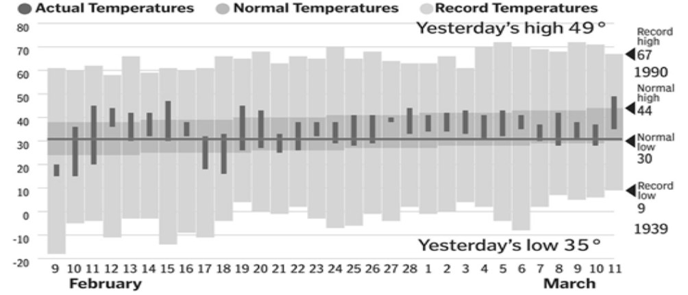
The record high for March 11 was 67˚F (19.44˚C) in 1990; the record low was 9˚F (-12.78˚C). The range, then, from record low to record high (the light-gray shaded area) is 58˚F (32.22˚C).
The normal high for March 11 over the period was 44˚F (6.67˚C), and the normal low was 30˚F (-1.11˚C). The range, then, from normal high to normal low was 14˚F (7.77˚C).
The actual maximum and minimum for each single day, February 9 through March 11, 2013, is depicted by the dark-gray vertical bars. The range on any given day runs from as much as about 25˚F (13.89˚C) for February 11 to as little as about 2˚F (1.11˚C) for February 27.
Now, here is the really stunning part of the graph. The thickness of the black horizontal line stretching all the way across the graph depicts the entire range of global average temperature (GAT) variation claimed for the period since the Industrial Revolution, illustrating, by comparison with the high/low ranges and the daily maximum/minimum ranges, how small the change in global average temperature is!
And that’s global average temperature—spread out over the whole globe, in other words, not concentrated in a single city, like Boston. The influence of that on any given locale cannot be significant.
NOAA offers a longer time series for its GAT “data” (really fudged) on the page that comes up if you click “learn more” next to that graph:
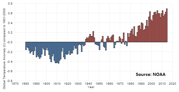
This graph shares the ominous appearance of the first one, again caused by the color choices and the very limited perpendicular scale. The coldest year appears to have been 1911, at 0.4˚C (0.72˚F) below the (alleged) 20th-century average. The (allegedly warmest) was 2014, at 0.7˚C above that average.
But the total spread is 1.1˚C (1.98˚F). But Boston’s temperature change within single days routinely runs 10–20˚F (5.6–11.1˚C)—five to ten times the range of GAT change in the entire 135 years covered by NOAA’s graph—and on no single day from February 9 through March 12 of 2013 was the range from maximum to minimum as narrow as the entire warming from 1880 to 2014.
About 23 years ago, when I was managing editor for a massive book project edited by the late Julian L. Simon, The State of Humanity, Julian taught me one of the most valuable lessons I’ve ever learned about graphing data: Whenever possible, use a zero baseline—or, if graphing percentages, a full 100-point spread—for the perpendicular (“Y”) axis. Anything else distorts proportions.
Failure to do that is one of the cardinal sins of the global warming alarmist movement—and it’s a sin that’s repeated thousands and thousands of times over, particularly in depicting temperature trends.
As Cornwall Alliance Senior Fellow Steven Hayward put it in the PowerLine Blog: “the typical chart of the global average temperature is usually displayed this way:
“Whoa! We’re all gonna fry!
“But what if you display the same data with the axis starting not just from zero, but from the lower bound of the actual experienced temperature range of the earth? I had never thought of this until an acquaintance sent it along today:
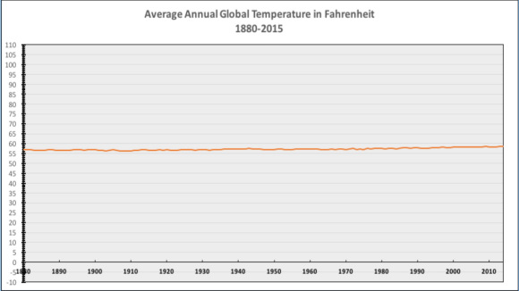
“A little hard to get worked up about this, isn’t it? In fact you can barely spot the warming. No wonder you need a college education to believe in the alarmist version of climate change. No wonder the data (click here for original NASA data if you want to replicate it yourself) is never displayed this way in any of the official climate reports.”
And that second graph only goes from -10 to +110˚F. To be really realistic, it should go from 0˚Kelvin (-273.15˚C, or -459.67˚F) to at least 330˚K (56.85˚C, or 134.33˚F), to give room near the top for the highest temperature ever recorded on Earth, 329.7˚K (56.67˚C, or 134˚F). On that scale, the 1.1˚C or K (1.98˚F) would equal a change of only 0.33 percent.
Well, composing this blog piece required about 2.5 hours, and it handles one of the simpler misrepresentations on the Climate.gov page. But I assure you, the others have similar flaws.
The page is, in short, propaganda. Pure propaganda. Designed to support an agenda set long before consulting any data. And that’s a shameful abuse of science by our government.
[This page was updated on November 25 to correct a link.]
Featured image, “I’m Not a Liar!” courtesy of Tristan Schmurr, Creative Commons, used by permission.

Pingback: On Climate and Economic Policy, What do the World’s Poor Need? | Cornwall Alliance
Pingback: 3 ways ‘climate change’ models are dead wrong
Pingback: Thursday December 12th, Dr. Charles Clough and The Global Warming Hoax. – York 912 Patriots