Back in 1954 journalist Darrell Huff published How to Lie with Statistics. The book exposed many different ways in which people use statistics, even true ones, to foist off falsehoods.
Today while looking for data on trends in the numbers of operating coal- and natural gas-fired power plants in the United States I came across an interesting example of lying with statistics, this one promulgated by the U.S. Energy Information Agency (EIA). The discussion that follows is rough; I don’t claim precision, just enough accuracy to make the point.
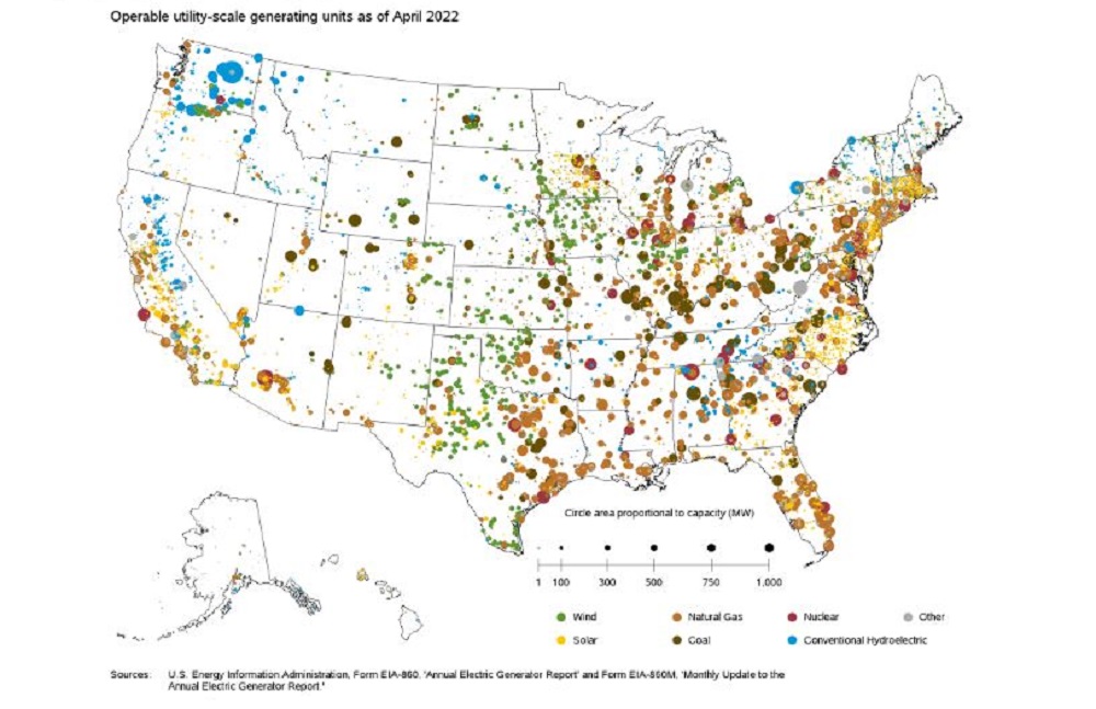
In the July 6, 2022, release of its Preliminary Monthly Electric Generator Inventory, the EIA provided this graph of “operable utility-scale generating units as of April 2022.”

Now, EIA is telling the truth with this graph. But at the same time, it’s lying, or at least misleading the uninformed, because most readers won’t know a crucial fact: generating capacity and actual electricity generated (capacity factor) are as different as night and day—in the case of solar, largely due to the difference between night and day.
The average U.S. wind generating facility actually generates only 35% of its capacity, and the average solar photovoltaic facility only about 16% (contrary to the EIA’s claimed 28%, which has been ably critiqued). The average hydropower plant operates at 37.1%.
What does this mean? Every green (wind) circle in EIA’s graph should shrink to slightly over one-third of its size, every blue circle to a little more above one-third of its size, and every yellow (solar) circle to just under one-sixth of its size.
But the average coal-fired power plant operates at about 60% capacity in winter and summer and somewhat less than 50% in fall and spring. Why the difference? Because they’re taken offline when there’s not enough demand for electricity, which happens more in the mild-weathered spring and fall than in winter and summer. Nonetheless, they can operate at well above 60% capacity when needed. Wind and solar cannot. So let’s figure that we reduce the size of each black (coal) circle in the graph by half, which is being ungenerous to coal but generous to wind and solar by comparison.
The two types of natural gas-fired power plants, combined cycle and “other,” operate at average capacities of about 62% and 54%, though they, too, can, when needed, operate at much higher capacity. Again being ungenerous to gas and generous to wind and solar by comparison, let’s assume an average for gas of 58%. So we shrink the orange/brown (gas) circles to about three-fifths of its size.
Nuclear plants, in contrast, operate at about 93% of capacity all year. So their circles stay almost unchanged—at over nine-tenths of their size. So, use your imagination to make those size adjustments and you’ll get a more accurate picture of the potential relative contributions of nuclear, gas, coal, wind, and solar to America’s electric grid. It’s no wonder that nuclear, despite the small number of its plants, provides about 19% of our electricity; natural gas about 38%; coal about 22%; and wind, hydro, and solar only about 9%, 6%, and less than 3%, respectively.


Pingback: Lügen mit Statistiken über amerikanische Strom-Energiequellen | EIKE - Europäisches Institut für Klima & Energie
Pingback: Lügen mit Statistiken über amerikanische Strom-Energiequellen – Aktuelle Nachrichten
Pingback: Lügen mit Statistiken über amerikanische Strom-Energiequellen • Cottbuser Freiheit
Pingback: Lügen mit Statistiken über amerikanische Strom-Energiequellen - FreeSpeech.international