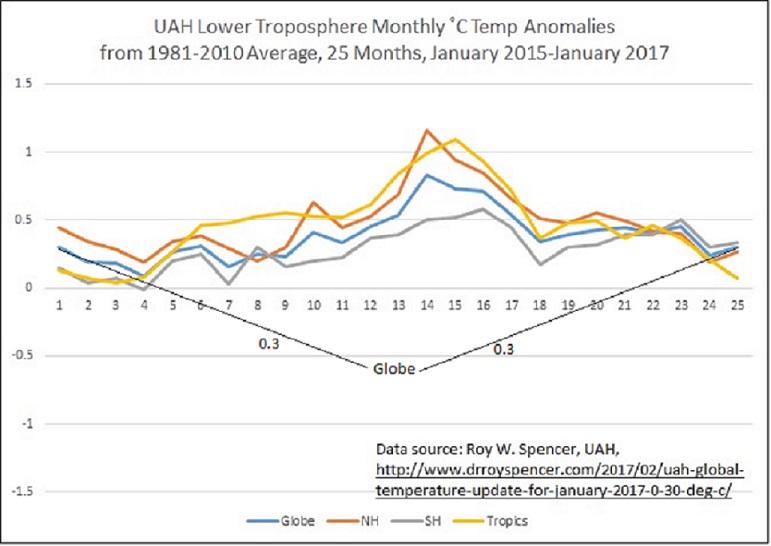
While reading Cornwall Alliance Senior Fellow Dr. Roy W. Spencer’s “UAH Global Temperature Update for January, 2017: +0.30 deg. C,” I happened to notice that the anomaly for the globe as a whole for January 2017 was identical to that of January 2015, at 0.3˚C. Then I eyeballed the anomalies for the intervening months in the table Roy provided and noticed quickly how prominently the effect of the super-El Niño that ran from late 2015 through most of 2016 was. In light of widespread questions about whether the marked global warming of that shorter period presaged a resumption of the long-term warming trend, ending the famous “pause” that stretched from early 1997 through late 2015, I thought it would be interesting to graph the anomalies over the last 25 months to show how prominent the El Niño was. Here’s the result.

El Niño’s effect is clear, and equally clear is the fact that, at least as of last month, its warming has pretty well ended, leaving us right back where we were at the start of 2015.
Did “the pause” end with the late-2015 through 2016 warming? Or was that warming attributable solely, or almost solely, to El Niño? Will “the pause” lengthen? Only time will tell. But one thing’s pretty sure. It’s downright difficult, at the moment, to insist that the 2015–2016 warming spelled the end of “the pause.”
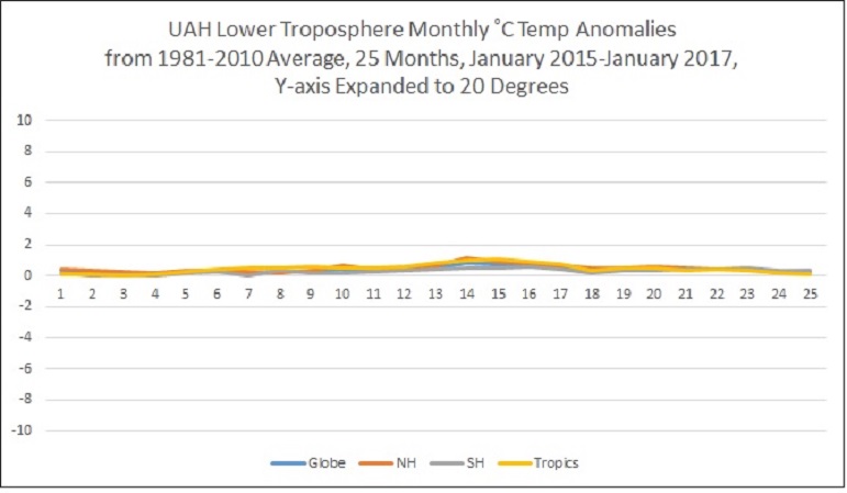
While I was at it, I also wondered how much difference it would make to the graphic impact of those numbers if the Y-axis were expanded to something reflecting the fairly ordinary range between daily low and high temperatures in many locations around the world. Quite unscientifically I chose a 20-degree range for the illustration—and since it’s only for illustration of the psychological effect of the graphic representation, that’s okay. Here’s the result.

Those anomalies don’t seem nearly so alarming this way, do they?
[Edited April 4, 2017, to correct two non-substantive typos.]


