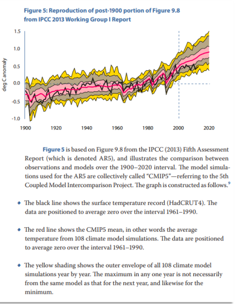
Back around 2014 many people, me included, were commenting on the discrepancy between climate models and observations. In a report for the Fraser Institute I showed the following graph:

The HadCRUT4 series (black) was then dipping below the 95% lower bound of the model distribution. The IPCC itself in the 5th Assessment Report (2013) noted that out of 114 model runs, 111 had overstated observed warming since the late 1990s. That same year, Hans von Storch told Der Spiegel that
If things continue as they have been, in five years, at the latest, we will need to acknowledge that something is fundamentally wrong with our climate models. A 20-year pause in global warming does not occur in a single modeled scenario. But even today, we are finding it very difficult to reconcile actual temperature trends with our expectations.
But before 2018 came along, the modelers were saved by the El.
El Nino, that is. The powerful 2015-16 El Nino caused temperatures to surge, apparently erasing the discrepancy. It was just in the nick of time. In 2018 the US National Assessment came out, using data sets ending in 2017, as did the Canadian counterpart, and they were able to declare that a lot of warming had occurred, more or less in line with model projections. Blog articles about the 30th anniversary of James Hansen’s predictions did the same.
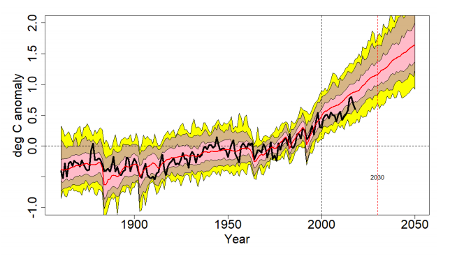
Well it’s a couple of years later and the El Nino heat has mostly gone from the climate system. What does the model-observational comparison look like now?

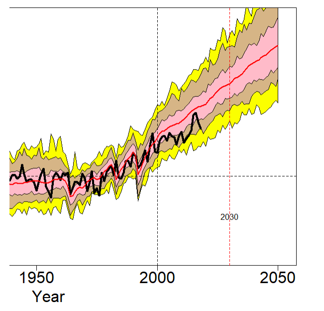
This graph, like the earlier one above, compares the HadCRUT4 surface temperature average (black line) against the CMIP5 mean (red line). The pink band shows the 1-sigma (67%) distribution and the tan band extends out to the 2-sigma (95%) distribution. The outer yellow bands show the lower and upper 2.5th percentiles. The lines are positioned so all models and observations are centered on a 1961-1990 zero mean. The model runs follow the RCP4.5 scenario and extend out to 2050. Let’s zoom in on the post-1950 interval

The HadCRUT4 series ends in 2018, which is the last complete year. Temperatures in 2018 (+0.60C) are back down to about where they were in 2014 (+0.58C). We’ll know in February or March where 2019 ends up.
The worry back in 2014 was that the Hadley (black) line had dropped below the 97.5th percentile envelope of the CMIP5 model runs. The El Nino pushed it almost all the way up to the mean, but only temporarily. It’s now back to the edge of the yellow band, meaning it’s skirting the bottom of the 95 percent confidence interval.
The big issue is not whether warming has “paused” or not, it’s how it compares to model projections. RCP4.5 is considered a medium, plausible projection. But it’s already pulling away from the observations.
I have indicated 2030 on the graph. That’s the year we all die, or something. But I think it’s more likely that will be the year by which the HadCRUT4 line drops out below the bottom of the CMIP5 RCP4.5 ensemble once and for all. The El Nino disguised the model-observational discrepancy for a few years, but it’s coming back.
There are other versions of this graph that don’t’ show such a discrepancy. Zeke Hausfather, for example, prefers to use a different set of CMIP5 outputs in which water surface temperatures rather than air temperatures from the (modeled) oceans are used to correspond to the sampling method in HadCRUT4. The result is that the model temperatures tilt down a bit towards observations. That’s fine, but when governments draw scary charts of future warming those aren’t the model runs they show us, instead they show charts like the one I’ve drawn, so I’m more interested in seeing how it compares to observations.
I referred above to the Der Spiegel interview with Hans von Storch back in 2013. I very much appreciate another of his comments:
Unfortunately, some scientists behave like preachers, delivering sermons to people. What this approach ignores is the fact that there are many threats in our world that must be weighed against one another. If I’m driving my car and find myself speeding toward an obstacle, I can’t simple yank the wheel to the side without first checking to see if I’ll instead be driving straight into a crowd of people. Climate researchers cannot and should not take this process of weighing different factors out of the hands of politics and society.
That is very well put.
This article was originally published at rossmckitrick.com.


We should all thank Ross McKitrick for performing this analysis. One can only wonder how much abuse and vilification he takes from climate alarmists for taking a disciplined stand based on the data. If, as he postulates might happen, the path of the HradCUT4 line drops below the CMIP5 “ensemble” completely by 2030, will governments and the media notice? I think alarmists have already switched the messaging to centre on alleged connections between increased carbon dioxide concentrations and extreme weather events. Confronting this thesis is certainly possible, but more complex.
It always seems hard to compare past graphs with new data (apples to apples). It’s not your fault but it makes it very hard to compare and audit their results and conclusions. Differences from: 1) graph starts at different years; 2) change year range used to calculate the offset/delta/0-line; 3) different measures like land, ocean, surface, troposphere; 4) changing model run or reruns that change results; 5) changes to inclusion/exclusion, sample points move and data has “corrections” applied; 6) graphs with labels and units missing; 7) no tables of data relating to the graph to get accurate values for comparisons; 8) data sources that require registration so mostly experts can download; 9) obfuscated naming so only a few experts can decipher their naming of fields and data series.
They should be more transparent and encourage more comparisons of data. Keep the running tally of individual models vs reality (not just the average), how did their assumptions compare to actuals. How does recent reductions to SO2 emissions increase temperatures?
Pingback: Klimawissenschaftler räumen übertriebene Erwärmung ein – Vijay Jayaraj, E. Calvin Beisner | Axel B.C. Krauss