(Editors Note: Click graphs to enlarge)
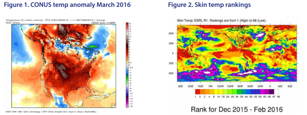
In the March 16, 2016, issue of Forbes astrophysicist Ethan Siegel’s article “The Next Great Global Warming ‘Hiatus’ is Coming!” sought to refute skeptics of catastrophic anthropogenic global warming (CAGW) by arguing that the apparent lack of statistically significant global warming over roughly the last 18 or 19 years is just one in a series of lulls in a long-term warming trend for which human action is responsible. His article, deftly argued and accompanied by stunning graphs, is one of the best defenses of fears of CAGW I’ve seen in major media, so I’d like to begin by responding to it at some length. Siegel begins with two frightening graphs (Figures 1 and 2), the first showing that during the first half of March most of North America was about 4.2°C warmer than the 1981–2010 average, and the second showing that for December 2015 through February 2016 the surface temperature of much of the world was warmer than at any time in the previous 67 years.
Scientists who believe in CAGW routinely use these sorts of images to generate fears. (The scary colours certainly help but are of purely emotional, not rational, value. Consider what happens if we turn that last graph from colour to grey scale-Figure 3).
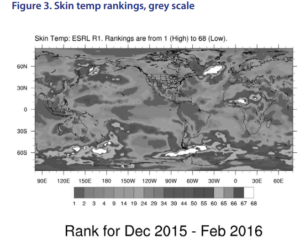 Doesn’t look nearly so scary, does it? I’m not arguing that colors shouldn’t be used—just pointing out that viewers need to distinguish between the emotional effect of alarming colors like the reds in this graph and the rational information being conveyed—and perhaps amplified.
But Siegel seems to undercut these graphs by explaining:
“The first thing we have to realize is that there are two things at play here: long-term trends, which is the gradual warming we’re seeing over generational timescales, and short-term variations, which are due to things like the seasons, volcanic eruptions, and weather events like El Niño and La Niña. The record-breaking temperatures we’re seeing across the globe are due to a combination of all the short-term and long-term variations superimposed atop one another, and so although February of 2016 was the hottest month ever recorded (note: don’t think this means through all human history. We haven’t been recording global temperature directly for more than about a century or very well for more than about 38 years—and the proxy temperature measurements going back farther give pretty good evidence that, eg, the Medieval Warm Period was warmer than today. But to return to Siegel’s words:) although last month … was the hottest month ever recorded, that isn’t necessarily a reason to freak out. You see, we’re currently experiencing an El Niño event.
… This peak in temperatures that we’re seeing now, the one that spans from 2015–2016, isn’t due to global warming. That is to say, most of the anomalously high temperatures we’re seeing are due to these short-term variations.”
Isn’t that reassuring? Siegel is no alarmist, is he? Maybe he even rejects alarmism.
Don’t be too quick to breathe a sigh of relief. He immediately adds:
“But what should be far more concerning to anyone who wants to know the truth about climate change is this: the long-term rise in temperatures is continuing at a steady rate. The fact that temperatures appear to be rising at a rate of between 0.40–0.80°C (0.72–1.44°F) per century, unabated, is the real cause for concern. That’s what global warming really is, the slow, long-term rise in temperatures. That’s also the component that humans— through emissions reduction, energy efficiency, renewable power, policy changes and (possibly) geo-engineering—can do something about.”
Before we go further, let me point out that a rate of change in global average temperature of 0.4–0.8°C per century is remarkably small. On any given day in most locales, the difference between high and low temperature is ten to twenty times that, and in any given year in most locales, the difference between summer and winter highs or summer and winter lows is twenty to forty or more times that—which is why my good friend Dr Richard Lindzen, who is Alfred P Sloan Professor of Meteorology, Emeritus, at Massachusetts Institute of Technology, says the proper response to the entire roughly 0.8–1.0°C increase in global average temperature since 1880 is “So what?”
Now let’s get to the point of Siegel’s title, “The Next Great Global Warming ‘Hiatus’ is Coming!” That title is a jab at skeptics of CAGW. Siegel warns readers that since the record-breaking temperatures of the last few months (which will probably continue for a good part of this year before El Niño peters out) will soon be followed by the cooling caused by La Niña (which normally follows), skeptics will immediately start claiming that global warming has stopped—or at least paused—since it could well be a decade or two, or three, before the long-term warming, with another unusually strong El Niño superimposed on it, brings us to new record highs.
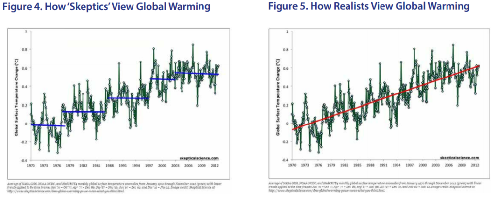
He illustrates his point powerfully with an animated graph (from the website SkepticalScience.com) showing the difference between how what he calls ‘skeptics’ (He should be credited for using this nicer term than ‘deniers,’ which rhetorically associates those who question CAGW with those who deny the Holocaust) view global warming and how what he calls ‘realists’ (which kind of presupposes something, does it not?) view global warming (Figure 5).
Look back and forth between those a few times so their message sinks in. In both, the green lines with circles in them show the average annual global surface temperatures according to five widely recognized sources. In the first graph (Figure 4), ‘How ‘Skeptics’ View Global Warming,’ the nearly level (and sometimes even downward-sloping) blue lines show the pauses in global warming, and according to Siegel the skeptics point to any given pause as evidence that global warming has stopped. (Actually, most don’t but argue from them in a different way that I’ll discuss shortly.) But as the red line in the second graph (Figure 5), ‘How Realists View Global Warming,’ shows, the long-term trend is clearly upward, and the pauses are really just that—pauses; none of them is a cessation.
(By the way, notice the scare quotes around ‘Skeptics,’ but the absence of any around ‘Realists’? That’s another rhetorical trick designed to shift your thinking without persuading you—just like calling his side ‘realists,’ for of course no one wants to question reality.)
Obviously, the long-term warming continues, despite the short-term pauses. Siegel then warns that “prominent climatologists … have made these arguments before ([and] will likely make [them] again), and they will be quoted in a great many news outlets and by numerous science writers.” But then he advises: “If you see an article that cites one of them claiming global warming has stopped and it isn’t yet 2033, the 17 years from now that we’re required to wait to see if the rise continues, please refer them back to this article.”
Convinced? Siegel thinks you should be, so he concludes:
“the fact that the global average temperature is rising—and that it continues to rise—is a real long-term problem facing the entire world. Don’t let dishonest arguments”—(How does Siegel know they’re dishonest? How does he know they’re not because these ‘prominent climatologists’ disagree with his interpretation of the data?)—“Don’t let dishonest arguments that gloss over the actual issue dissuade you from the scientific facts. We can fool ourselves into believing that there isn’t a problem until it’s too late to do anything about it, or we can own up to what the science tells us, and face this problem with the full force of human ingenuity. The choice is ours.”
Yes, we do have some choices to make. But before we make them, I’d like to do a little testing of Siegel’s reasoning—which is quite representative of that by CAGW advocates generally.
Let’s begin by considering his caveat: “If you see an article … claiming global warming has stopped and it isn’t yet 2033, the 17 years from now that we’re required to wait to see if the rise continues, please refer them back to this article.” Siegel thinks a 17-year pause can fit comfortably in with the theory of CAGW—which is that human emissions of CO2 are driving dangerous global warming. There are some problems with that.
The first problem is that the least-squares linear regression of satellite global temperature data showed no global warming from February 1997 through October 2015, 18 years and 9 months (Figure 6). That’s more than 50% longer than the roughly twelve years shown in the last pause of the “How ‘Skeptics’ View Global Warming” graph Siegel used, and about 10% longer than the 17 years Siegel thinks would be consistent with the theory.
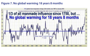
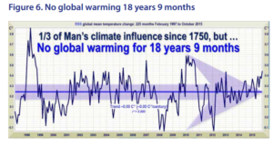 The current short-term warming Siegel attributes to El Niño (and others attribute in part also to a reversal of the Pacific Decadal Oscillation from negative to positive—the two combined making for even more warming) has shortened the ‘pause,’ as illustrated in this graph, to 18 years and 8 months (June 1997–January 2016, Figure 7) and will shorten it further as El Niño’s influence continues, but the fact remains that at its maximum the period without warming significantly exceeded 17 years.
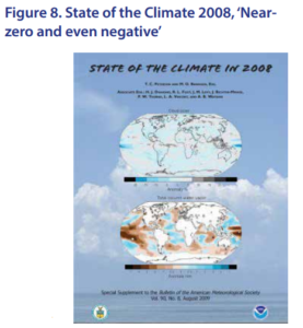
The second problem is that even climate scientists who embrace CAGW previously admitted that a period of just 15 years without warming would be difficult if not impossible to reconcile with the theory. In its State of the Climate in 2008 the National Atmospheric and Oceanic Administration stated, “Near-zero and even negative trends are common for intervals of a decade or less in the simulations, due to the model’s internal climate variability. The simulations rule out (at the 95% level) zero trends for intervals of 15 years or more, suggesting that an observed absence of warming of this duration is needed to create a discrepancy with the expected present-day warming rate” (emphasis added, Figure 8).
Likewise, Phil Jones, Director of the Climate Research Unit at the University of East Anglia, said in an email to a colleague in 2009, “Bottom line: the ‘no upward trend’ has to continue for a total of 15 years before we get worried.” So where did Siegel come up with 17 years?
The third problem is that the periods with and without warming over the last 40 years or so are about equal in length, which suggests that if the periods without warming aren’t sufficient to invalidate the climate models, neither are the periods with warming sufficient to validate them.
Now let’s go back to what I consider the most important paragraph of Siegel’s article: “The fact that temperatures appear to be rising at a rate of between 0.40–0.80°C (0.72–1.44°F) per century, unabated, is the real cause for concern. That’s what global warming really is, the slow, long-term rise in temperatures. That’s also the component that humans— through emissions reduction, energy efficiency, renewable power, policy changes and (possibly) geo-engineering—can do something about.”
In short, Siegel recommends that we “do something about” this long-term temperature rise “through emission reductions, energy efficiency, renewable power, policy changes and (possibly) geo-engineering.”
I will address his prescription later, but it’s time now to consider a very intriguing fact. Without acknowledging it, Siegel implicitly gives away the store when he says, “temperatures appear to be rising at a rate of between 0.40–0.80°C (0.72–1.44°F) per century, unabated.” Ignore for the moment his saying the rise is ‘at a steady rate’ or ‘unabated,’ when the pauses even in the graph he offers of “How ‘Skeptics’ View Global Warming” show clearly that it is not steady but regularly abated. The key is in the rate he affirms: “between 0.40–0.80°C per century.”
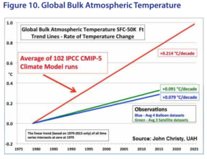
How does this give away the store? The computer climate models on which the United Nations Intergovernmental Panel on Climate Change (IPCC), various national agencies, and various climate-change advocacy groups rely for their forecasts of anthropogenic global warming dangerous enough to justify abatement policies costing hundreds of billions to trillions of dollars predict that global average temperature should be rising at a rate of about 0.214°C per decade, ie, about 2.14°C per century. (And that’s only the warming that should be coming from human emissions of CO2 ; if any of the long-term warming trend is natural, the combined trend should be even higher.)
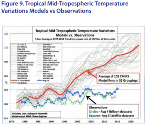 But as climatologist John Christy of the University of Alabama, one of the best known of the ‘skeptics,’ has shown, the actually observed warming rate is about 0.079°C (according to weather balloon data) to 0.091°C (according to satellite data) per decade, or about 0.79°C to 0.91°C per century. Figure 9 shows the projections for mid-tropospheric temperature variations by 102 climate models, grouped into 32 groups in the dotted lines and as an overall average in the thick red line. It also shows the annual average of four weather balloon datasets in the green line with circles, and of three satellite datasets in the blue line with squares. All the data are graphed so that the trend lines meet at zero in 1979. As you can see, the model projections diverge rapidly from the observations in the early 1980s; from 1995 to about 2000 they rarely
  intersect the observations; and from 2000 onward they never intersect the observations.
Figure 10 shows the same data plotted as straightline trends. The red line shows the average of the 102 computer models, the blue line the observations by weather balloons, and the green line the observations by satellites.
As these graphs show, the models predict about 2.4 to 2.7 times as much warming as the satellite and balloon data show.
As an aside, let me point out, in case you’re concerned because Christy’s data are for the mid-troposphere while Siegel’s are for surface temperatures, that according to greenhouse warming theory, the mid-troposphere should warm more than the surface, so these data don’t imply underestimates of surface warming trends.
Now, what warming rate did Siegel say is a “real cause for concern … that humans … can do something about”? 0.4 to 0.8°C per century, or 0.04°C to 0.08°C per decade, based on surface temperature readings.
The computer models predict, on average, about 2.8 times as much warming as Siegel’s upper-end estimate of the observed long-term warming rate, and 5.4 times as much warming as his lower-end estimate.
 Furthermore, Siegel’s lower-end estimate of the observed warming rate, 0.04°C per decade, is about half the balloon estimate of 0.079°C per decade, and his upper-end estimate, 0.08°C per decade, is about ninetenths of the satellite estimate of 0.091°C per decade.
In short, Siegel’s estimates of the actual warming rate are more skeptical than the ‘skeptics’ estimates!
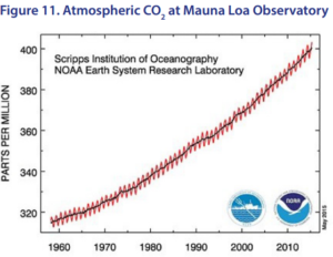
Now let me back up to one of Siegel’s claims that I told you a little bit ago to ignore for a moment: that the observed warming has been at ‘a steady rate,’ ‘unabated.’ As I said then, the nearly flat blue lines in the graph he offers labeled “How ‘Skeptics’ View Global Warming” show that the warming is not steady but is regularly abated. But that’s not the only problem. The claim by those who believe in CAGW is that human emissions of CO2 have caused most of the global warming since about 1960. If CO2 is the primary driver, the temperature trend should follow it closely. But here’s what atmospheric CO2 concentration has done (Figure 11): The red squiggly line shows the seasonal variation (because CO2 concentration rises in the Northern Hemisphere’s winter as plants go dormant and absorb less, and falls in summer as plants grow and absorb more), and the black line shows the smoothed average. What is clear is that CO2 ’s rise has been—shall we say, borrowing Siegel’s words that inaccurately described global average temperature—‘steady’ and ‘unabated,’ not intermittent, like temperature’s.
In short, while the correlation between CO2 and temperature over the entire time is reasonably close, CO2 ’s curve does not show the intermittency that the temperature data show, which means the correlation is poor.
But poor does not equal nonexistent. There is in fact a correlation between atmospheric CO2 concentration and global average temperature. The problem for those who, like Siegel, insist that our CO2 emissions are the primary driver of global warming over the last half century or so is that the sequence is the opposite of what it should be for that theory to be true: temperature leads CO2 rather than vice versa.
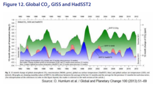 Over very long time scales (measured in hundreds of thousands to millions of years), a study of Antarctic ice cores dating back 270,000 years published in Science in 1999 by H Fischer, et al. found that CO2 concentrations lagged temperature by from 200 to 1,000 years. But what about shorter time scales? As illustrated in Figure 12, a study by O. Humlum et al. published in Global and Planetary Change in 2013 examining the lags and leads between a number of annually averaged variables including
- surface air temperature from the Climatic Research Unit of the University of East Anglia and the Hadley Centre,
- surface air temperature data from the Goddard Institute for Space Studies,
- surface air temperature data from the US National Climatic Data Center,
- sea surface temperature data from the Hadley Centre,
- lower troposphere air temperature data from the University of Alabama–Huntsville,
- globally averaged marine CO2 data,
- data on anthropogenic releases of CO2 from the Carbon Dioxide Information and Analysis Center, and
- global warming potential data on volcanic eruptions
concluded that “changes in the amount of atmospheric CO2 always [lag] behind corresponding changes in air temperature,” with “the maximum positive correlation between CO2 and temperature … found for CO2 lagging 11–12 months in relation to global sea surface temperature, 9.5–10 months to global surface air temperature, and about 9 months to global lower troposphere temperature.”
Moreover, as Cornwall Alliance Senior Fellow and University of Delaware climatology professor David Legates explains in commenting on those studies, changes in ocean temperatures are good predictors of the observed changes in atmospheric CO2 (because seawater releases CO2 as it warms and sequesters it as it cools) while CO2 released from anthropogenic sources is not well correlated with changes in total atmospheric CO2.
I will conclude this portion of my article with the observation that, as shown in Figure 13, climate models ‘run hot.’ The grey bars are based on 117 model simulations, and the black curves are smoothed versions of their simulated trends. The red hatching depicts observed trends from 100 reconstructions of the HadCRUT4 global temperature 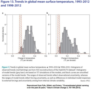 dataset. The left graph covers 1993–2012, in which only two of the grey bars fall within the red hatching. The right graph covers the shorter period 1998– 2012, while only one grey bar falls within the red hatching.
As we saw earlier with the comparison of model simulations to satellite and weather balloon observations, the overwhelming majority of the simulations depicts more than twice the warming actually observed.
Nobel Prize-winning physicist Richard Feynman explained ‘the key to science’ this way:
“In general we look for a new law by the following process. First we guess it. Then we compute the consequences of the guess to see what would be implied if this law that we guessed is right. Then we compare the result of the computation to nature, with experiment or experience, compare it directly with observation, to see if it works. If it disagrees with experiment it is wrong.
“In that simple statement is the key to science. It does not make any difference how beautiful your guess is. It does not make any difference how smart you are, who made the guess, or what his name is—if it disagrees with experiment it is wrong. That is all there is to it.”
This is why more and more climate scientists around the world are reassessing just how much warming should come from CO2 added to the atmosphere. The term for this is climate sensitivity, which climate scientists define as the amount that global average temperature should rise in response to doubled atmospheric CO2 concentration. Whereas the IPCC has, since 1988, estimated climate sensitivity at 1.5–4.5°C with 3°C as ‘best estimate,’ based on models, climate scientists incorporating increasing empirical data are offering significantly lower estimates, as Figure 14 shows.
The blue dots represent estimates of transient climate response (TCR), that is, temperature change at the time of CO2 doubling. The red dots represent estimates of equilibrium climate sensitivity (ECS), that is, temperature change from doubled CO2 at equilibrium, after all climate feedbacks have been accounted for, which is generally estimated to take a century or more. As you can see, later estimates of both ECS and TCR are significantly lower than earlier estimates.
Keep in mind that the last of those studies was published in 2013. After that the ‘pause’ in global warming extended through two more years, offering additional reason to reduce both TCR and ECS estimates. As the Cornwall Alliance pointed out in A Call to Truth, Prudence, and Protection of the Poor 2014: The Case against Harmful Climate Policies Gets Stronger, “Newer, observationally based estimates have ranges like 0.3°C to 1.0°C (NIPCC 2013a, p. 7) or 1.25°C to 3.0°C with a best estimate of 1.75°C (Lewis and Crok 2013, p. 9).”
I’ll conclude this portion of my presentation this way: I think it’s highly likely that adding CO2 to the atmosphere will make global average temperature warmer than it otherwise would be, all other things being equal, but I think the magnitude of the warming will be much less—most likely in the range of one-third to one-half, but perhaps even as little as one-sixth—that predicted by the IPCC and other advocates of CAGW.
Because
- on average the computer climate models on which advocates of CAGW depend simulate two to three times the actually observed warming, and because
- over 95% simulate more warming than observed (which implies that the errors are not random, in which case they’d be equally often and equally much below as above, but rather are driven by some kind of bias, whether honest mistake or dishonest fudging, written right into the models), and because
- none of the models predicted the nearly 19-year absence of statistically significant global warming starting in early 1997,
we can safely conclude that the models are invalidated. This in turn means they provide no rational basis for predictions about future temperature or anything dependent on it—whether extreme weather events, rate of sea level rise, or changes in ecosystems or the human economy. And that in turn means they provide no rational basis for any policy in response to any such predictions.
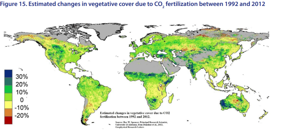
At the same time, however, literally thousands of empirical—not modeling—studies reveal that adding CO2 to the atmosphere has tremendous beneficial effects for all living things. On average, for every doubling of CO2 concentration in the atmosphere, there is a 35% increase in plant growth efficiency. Plants grow better in warmer and colder temperatures and in wetter and drier soils, make better use of soil nutrients, and resist diseases and pests better, widening their ranges and, as shown in Figure 15, greening the planet. They improve their fruit-to-fibre ratio.
The result is more food for everything that eats plants—and everything that eats things that eat plants. Estimates of increased agricultural productivity due to the CO2 we’ve added to the atmosphere since about 1950 range from about 11% to 15%, with added crop value since 1960 estimated at about $3.2 trillion. Who benefits most from this? The world’s poor, who are most vulnerable to high food prices and benefit most from declining food prices.
So it is not only all the direct benefits of the energy we produce from fossil fuels—energy to light our homes and workplaces, to operate all our transport and communications systems, to run our hospitals, factories, and refrigerators, indeed almost everything we do all day every day—it is not only all those direct benefits but also the indirect benefit of the biological enhancement from rising atmospheric CO2 that we owe to our use of fossil fuels. Any alleged costs from CO2 ’s influence on climate must be balanced against such gains, and any alleged climate-related benefits of reducing our CO2 emissions must be balanced against the reduction of these benefits.
This brings us to another aspect of this controversy—the one that, because of the Bible’s insistence on helping and protecting the poor, motivates my work in this field: the wisdom of policies prescribed to mitigate anthropogenic global warming. All of those policies emphasize the need to reduce CO2 emissions, and all call for us to do that by ‘decarbonizing’ the world’s energy systems—substituting renewable energy sources, especially wind and solar, for hydrocarbon, otherwise known as fossil, fuels.
I’m going to begin this discussion by asking you what you might think is a rather strange question: how many calories do you consume each day? If you’re about average for Americans, your answer was probably about 2,700. And if it was, you’re way off. Actually, the average American consumes about 186,000 calories per day.
Impossible, you say? Only if you count only food intake. But calories are measures of energy, and most of the calories we consume don’t come from food. They come from the energy we use when we turn on a light or computer, drive our cars, use our cell phones, or do pretty much anything else. Add that all up and, for the average American, it comes to about 186,000 calories per day—about 60 times as many calories as we get from food. And 98% of that energy is in the form of machine power. It serves us, minute by minute, uncomplaining, and it is largely responsible for the fact that Americans born today can expect to live nearly three times as long as their ancestors born before the Industrial Revolution.
Very few—perhaps 1 in 100—of our ancestors consumed that much energy in a day, and for them very little of it was in the form of machine power. It was instead mostly in the form of animal and slave labor. The animals and slaves got their energy from food. And in those days, average daily calorie intake from food per person was probably under 2,000, meaning that for anyone to benefit from 186,000 calories of energy per day required harnessing the energy equivalent, and the production equivalent, of about 93 slaves.
Today, instead, we get most of our energy from fossil fuels. Worldwide, about 87% of all energy consumed comes from fossil fuels, and most of the remainder from hydro (about 7%) and nuclear (4%). Harnessing energy through machines instead of animals and slaves enables us to benefit from a level of energy consumption that only a tiny minority had three centuries ago—even while abolishing slavery.
What this means is that the energy we derive from fossil fuels provides two great moral benefits: first, about 87% of all the products and services that give us longer, healthier lives than our ancestors, and second, the elimination of the demand for slave labor. That’s right: energy from fossil fuels played an integral role in the elimination of slavery from Western civilization.
Today, however, environmentalists call our use of fossil fuels an ‘addiction’ analogous to smoking tobacco or taking hallucinogenic drugs. They warn that by obtaining energy from coal, oil, and natural gas, we’re causing dangerous global warming—a claim I’ve just argued is at best grossly exaggerated. They demand that we curtail that use— even stop it completely, even at a cost of literally trillions of dollars that otherwise be spent far more efficiently to reduce hunger and disease and increase education, health care, and other benefits worldwide.
One might as well demand that the average person cut his food intake from 2,700 calories a day to 300 because the other 2,400 are his ‘addiction’ to food. Abundant, affordable, reliable energy is indispensable to lifting and keeping whole societies out of poverty, and fossil fuels are and for decades to come will remain, along with nuclear and hydro, the best sources.
The ministry I lead, the Cornwall Alliance for the Stewardship of Creation, has just published a new edition of the excellent study Fossil Fuels: The Moral Case. In it my friend Kathleen Hartnett White, former chairman and commissioner of the Texas Commission on Environmental Quality, traces some of the benefits that come from fossil fuels.
Don’t misunderstand me. As my friend Dr. William Happer, Cyrus Fogg Brackett Professor of Physics at Princeton, Emeritus, and former Director of the US Department of Energy’s Office of Science, notes in a forthcoming paper,
“fossil fuels must be extracted responsibly, minimizing environmental damage from mining and drilling operations, and with due consideration of costs and benefits. Similarly, fossil fuels must be burned responsibly, deploying cost-effective technologies that minimize emissions of real pollutants such as fly ash, carbon monoxide, oxides of sulphur and nitrogen, heavy metals, volatile organic compounds, etc.”
Those are the real risks from fossil fuels, and in developed countries we apply technologies that minimize them to the point where their risks are negligible and certainly aren’t enough to counterbalance the benefits of the energy we generate.
But carbon dioxide (safe for humans for long periods at 5,000 parts per million, exhaled by humans at 40,000 parts per million, and now at about 400 parts per million in the atmosphere as a whole) is not a pollutant, and because human material wellbeing depends heavily on access to abundant, affordable, reliable energy, and because fossil fuels are and for the foreseeable future will continue to be, along with nuclear and hydro, our best source of such energy, the demand to reduce our use of fossil fuels to reduce our CO2 emissions to reduce man-made global warming amounts to a demand to reduce human material wellbeing—which I believe is immoral.
Consider six graphs, all constructed at the marvelous Gapminder World website using World Bank, International Monetary Fund, United Nations, and other official data, demonstrating the relationship between hydrocarbon fuel use and three measures of human wellbeing: infant and child mortality, human life expectancy, and income per capita.
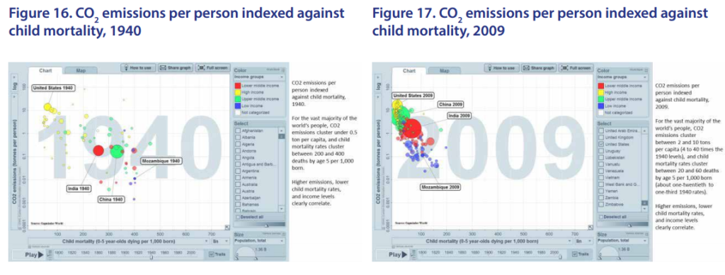
Figure 16 graphs CO2 emissions per person against child mortality in 1940. Each circle represents a country, the sizes indicating relative population, and the colors representing GDP per capita by nation—yellow being high, green upper middle, red lower middle, blue low, and colorless not categorized. The higher a circle falls on the scale, the higher the per capita emissions of CO2 . The farther to the right a circle falls, the higher the child mortality rate.
In 1940, for the vast majority of the world‘s people, CO2 emissions clustered under one-half ton per capita, and child mortality rates clustered between 200 and 400 deaths by age 5 per 1,000 born. Higher emissions, lower child mortality rates, and higher income levels clearly correlate.
Sixty-nine years later, the circles have shifted to the left, showing declining child mortality rates; they have also shifted upward, showing rising CO2 emissions (Figure 17). In 2009, for the vast majority of the world’s people, CO2 emissions cluster between 2 and 10 tons per capita (4 to 40 times the 1940 levels), and child mortality rates cluster between 20 and 60 deaths by age 5 per 1,000 born (about one-third to one-twentieth the 1940 rates) Higher emissions, lower child mortality rates, and higher income levels clearly correlate.
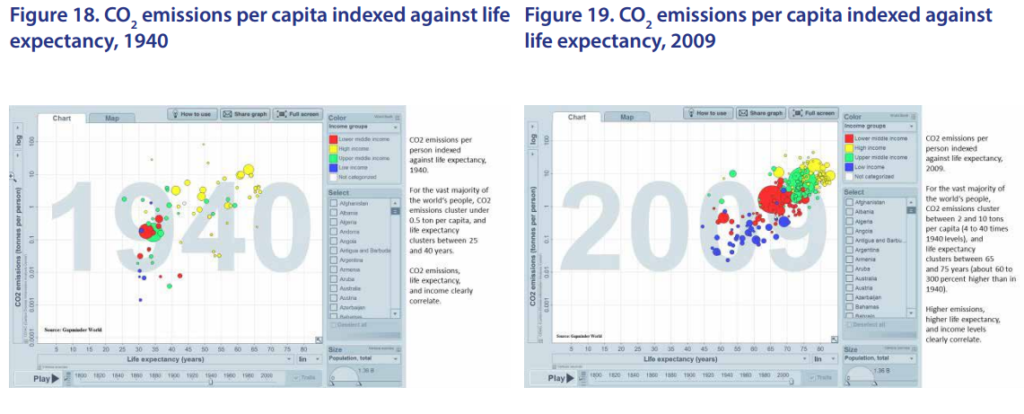
Now we’ll compare 1940 and 2009 measures of human life expectancy. Here the circles’ horizontal location represents life expectancy. In 1940, for the vast majority of the world‘s people, when CO2 emissions, we remember, clustered under one-half ton per capita, life expectancy clustered between 25 and 40 years (Figure 18).
 In 2009, for the vast majority of the world‘s people, with CO2 emissions 4 to 40 times higher, life expectancy clusters between 65 and 75 years—about 60 to 300 percent higher than in 1940 (Figure 19). Higher emissions, higher life expectancy, and income levels clearly correlate.
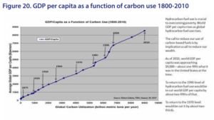
Figure 20 shows GDP per capita, on the vertical scale, as a function of hydrocarbon fuel use, on the horizontal scale, from 1800 to 2010. If we value human material wellbeing, we want to see GDP per capita rising; it does so only as hydrocarbon fuel use also rises.
The call to reduce our use of carbon-based fuels is by implication a call to reduce our wealth. As of 2010, world GDP per capita was approaching $9,000—about one-fifth what it was in the United States at the time. To return to the 1990 level of hydrocarbon fuel use would be to cut world GDP per capita by about two-fifths of that. To return to the 1970 level would be cut it by about two-thirds. And the cuts in GDP per capita would bring proportionate increases in infant and child mortality and declines in life expectancy, as well as other losses to human wellbeing.
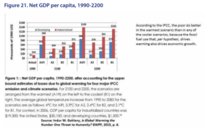 As we see in Figure 21, according to the IPCC’s coupled climate and economic modelling, the world’s poorer nations measured by per capita income are expected to become richest at the end of this century and the next under the warmest scenario. Why does that happen? Because the climate models derive the magnitude of warming from the amount of economic growth, and they (safely) assume the economic growth to be driven primarily by fossil fuel use; the lower the fossil fuel use (ie, the more successful the efforts to mitigate warming by reducing CO2 emissions), the lower the economic growth, and vice versa, the higher the fossil fuel use, the higher the economic growth.
In other words, even according to the IPCC’s own modelling, assuming high ‘climate sensitivity’ (how much warming comes from added CO2 ) even though as we have seen empirical observation increasingly points to low ‘climate sensitivity,’ fighting global warming does more harm than good as measured by income per capita.
As an aside, here’s an ethical point to consider. Under all the IPCC’s scenarios, future generations are wealthier than the present generation. Calling for people today to bear the burden of trillions of dollars’ worth of climate mitigation by decarbonizing their energy systems means asking the poorer of today to sacrifice for the sake of the richer of tomorrow.
Why is it so important to consider the impact of CO2 reductions on economies? Because of this simple insight: The wealthier you are, the more different climates in which you can thrive, and the better able you are to survive extreme weather.
The corollary is that the poorer you are, the less able you are to thrive in any climate, or to survive any extreme weather event. If your income is even equivalent to today’s lower-middle-class in America, you can live a healthy, safe, long life in any climate from the Arctic Circle to the Sahara Desert or the Brazilian rainforest. If you’re poor, you can’t thrive in the most idyllic tropical paradise.
These insights yield this implication: Since abundant, affordable, reliable energy promotes wealth, and nuclear and fossil fuels are now and for the foreseeable future will be our best sources of said energy, those sources enhance human thriving and survival, and human thriving and survival are reduced proportionate to the reduction in humans’ use of them.
As my friend John Christy, a climatologist at the University of Alabama and former missionary in Kenya, explains, the primitive energy system dominant among the world’s poorest 1.3 or so billion people works this way: the average woman in sub-Saharan Africa spends 6 to 8 hours per day gathering wood and dung as her primary cooking and heating fuel, leaving her precious little time and bodily energy for other productive activities to lift herself and her children out of poverty. Smoke from that kills about 4 million a year, mostly women and children, and debilitates hundreds of millions for varying periods and at varying degrees, because it causes upper respiratory diseases and eye infections.
The poor of this world desperately need to replace that primitive energy system with the modern one in which coal, natural gas, and nuclear materials are used to generate clean electricity delivered at scale (meaning in utterly enormous quantities), on demand (meaning it’s there, every time, instantly, when you need it), without interruption (meaning with no brownouts or blackouts), through grids not only for cooking and heating but also for light and refrigeration and automated clothes washing and drying and computing and industry and business and commerce and health care.
Some people will respond to all of this by saying, “I understand that energy is important to lifting and keeping people out of poverty, but why does it have to be fossil fuel energy? Why not power our grids with wind, solar, and biofuels to minimize global warming?” The answer is magnitude, cost, and dependability. It’s not just that we need energy. It’s that we need abundant, affordable, reliable energy.
As this chart from the Institute for Energy Research shows (Figure 22), it is less expensive to generate the vast amount of steady, on-demand, uninterrupted electricity that we need for human thriving from fossil fuels than from 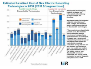 wind and solar. Don’t be deceived. While the estimated cost of new electric generating technology for onshore wind ($86.60 per megawatthour) is lower than for conventional coal ($100.10) on a straight per-megawatt hour basis, there is a tremendous difference. Electricity generated from coal is dispatchable: ie, it is instantly available and not vulnerable to the intermittency of wind, sunlight, and river flow. Electricity generated from wind (and solar) is non-dispatchable, ie, it is subject to intermittency and requires instantaneous backup by dispatchable technologies.
As IER explains:
“The more that no-dispatchable power is used, the more the electrical system requires investments in dispatchable generation forms to back up its increased use. Government policies that promote the use of non-dispatchable power are equivalent to requiring consumers to buy and care for two vehicles: one that works when you need it, and another that works when it feels like it. The hidden costs of non-dispatchable power are substantial and should not be overlooked as part of the public policy discussion.”
The campaign to fight global warming by reducing fossil fuel use is at bottom a campaign to retain, especially in the world’s poor countries, the primitive energy system and its accompanying low incomes and high rates of disease and premature death. It is in fact a campaign of anti-humanism.
It follows that such a policy should be taken only if its benefits clearly exceed its costs, and that can only be true if the amount of warming caused by our CO2 emissions is very high indeed—in fact, significantly higher than even the IPCC claims. As we saw earlier, however, climate sensitivity is probably significantly lower than the IPCC claims, leaving no justification for the campaign to decarbonize the world’s energy system.
The Second Great Commandment is, ‘Love your neighbor as yourself.’ In light of what I’ve presented here, I believe loving our neighbor implies rejecting the exaggerated claims of anthropogenic global warming, asserting the benefits of both the energy and the biological enhancement effects of fossil fuel use, and therefore rejecting calls to mitigate global warming by reducing CO2 emissions.
What are a few things you can do in light of this information, to help protect the world’s poor from misguided climate and energy policies?
Let me invite you to:
- come to cornwallalliance.org and read the studies and articles there by the roughly 60 scholars in our network;
- sign our petition Forget ‘Climate Change’, Energy Empowers the Poor;
- view our YouTube video series Greener on the Other Side: Climate Alarmism—Facts, Not Fear, in which we interview over 30 world-class scholars in this field, and share them with friends through social media;
- show our new documentary Where the Grass Is Greener: Biblical Stewardship vs. Climate Alarmism to friends and at your church;
- read and sign our Open Letter on Climate Change and send copies of it to your elected representatives at local, state, and federal levels;
- subscribe to our email newsletter to stay informed on new developments and how you can let elected officials know what you think on these issues;
- follow and ‘Like’ us on Facebook; and
- visit EarthRisingBlog.com, our blog specifically geared toward Millennials.
(This article was delivered as a lecture sponsored by International Student Ministries at The Pennsylvania State University March 25, 2016, and was modified for publication in World Commerce Review, June 2016.)

