That’s the implication of new analysis of NOAA radiosonde (weather balloon) data by Tony Heller at RealClimateScience.com. Heller begins:
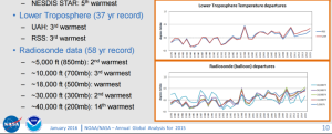
In their “hottest year ever” press briefing, NOAA included this graph, which stated that they have a 58 year long radiosonde temperature record. But they only showed the last 37 years in the graph.
NESDIS Strategic Communications
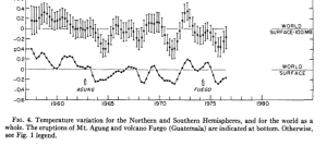
Here is why they are hiding the rest of the data. The earlier data showed as much pre-1979 cooling as the post-1979 warming.
1520-0493(1978)106<0755:GTVSMA>2.0.CO;2
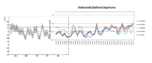
I combined the two graphs at the same scale below, and put a horizontal red reference line in, which shows that the earth’s atmosphere has not warmed at all since the late 1950’s
The omission of this data from the NOAA report, is just their latest attempt to defraud the public. NOAA’s best data shows no warming for 60 years.
Heller then goes on to say, “But it gets worse. The graph in the NOAA report shows about 0.5C warming from 1979 to 2010, but their original published data shows little warming during that period,” and he provides the graph of original and “adjusted” data to illustrate.
So, has the earth’s atmosphere really warmed over the last 18, or 58, years? I don’t think Heller’s analysis is conclusive, but it’s one of the many reasons why those following the controversy closely have little patience for the “science is settled” mantra.


Weather Balloon Temperature Anomaly Data
Here are the complete weather balloon temperature anomaly records for the 850mb, 700mb, and 500mb levels. (About 4,000 to 5,000 feet above sea level, about 9,000 to 10,000 feet above sea level, and about 18,000 to 19,000 feet above sea level.) These are the standard levels for the lowest half of the atmosphere. (Lower troposphere)
850 mb level: https://www.durangobill.com/TempPictures/RATPAC850mb.png
700 mb level: https://www.durangobill.com/TempPictures/RATPAC700mb.png
500 mb level: https://www.durangobill.com/TempPictures/RATPAC500mb.png
Warming has been particularly pronounced 6 miles up over the tropics
https://www.durangobill.com/TempPictures/RATPACtropics300mb.png
(Radiosonde Atmospheric Temperature Products for Accessing Climate (RATPAC))
The description for the above charts can be found at:
https://www.ncdc.noaa.gov/data-access/weather-balloon/radiosonde-atmospheric-temperature-products-accessing-climate
If you follow a couple of links at the above webpage, you can access the source data for the above charts. It’s the 850 mb, 700mb, and 500 mb data in the “Globe” section at:
https://www1.ncdc.noaa.gov/pub/data/ratpac/ratpac-a/RATPAC-A-annual-levels.txt
And according to NOAA’s own admission, 91.1% of the U.S. government network of thousands of weather reporting stations are rated bad, poor or very poor in terms of quality of data and proper siting. Ref: Journal of Geophysical Research Vol. 116, D14120 2011. When NOAA places brand new sensors, just last year, on the side of a major intersection over a concrete slab, you know they’re trying to cook the weather books! NOAA’s own guidelines say “the sensor should be at least 100 feet from any paved or concrete surface” so why not put a big slab of concrete right under the temp sensor! The greatest scientific fraud of our time! Ref: http://www.nws.noaa.gov/os/coop/standard.htm