Guest article by Joakim Book
Journalism is hard. To portray the world accurately to a layman audience without delving into the complexities and nuances of the universe we inhabit, writers must always simplify, explain, and make difficult content relatable for their readers. You can do this well and comprehensively, and you can do it poorly.
Often, writers simplify and give concrete examples with the best of intentions, even though I don’t put it past some of the activist writers out there to fudge what they portray and fidget with the details. But what really strikes a nerve with me is when writers end up misleading so grossly that their readers walk away with a completely twisted view of the world. The late Hans Rosling was a master at pricking the bubbles that these mistakes had created in our heads.
I have summarized his perhaps most valuable advice to Always Be Comparing Thy Number; never let numbers stand alone; always have readily available comparisons that let you answer the crucial questions: is that a lot? What was it last year? Ten years ago? Do informed researchers think it’s a lot?
Most of us don’t walk around with easily comparable frameworks for what’s a large and small number in areas we know nothing about – how many people normally die in car accidents or from medical errors, how long the Amazon River is or how much ice there is in the world. Implicitly or explicitly, we rely on fact-checking journalists to tell us in the process of covering the crucial topic they’re writing about.
Too often, they don’t. And not only do they neglect their professional role, they tend to make our misunderstandings worse when they actually engage in contrived comparisons. In any story that includes climate change this tendency seems to have gone completely haywire (maybe the covidocracy can give it a run for its money).
Far from being settled, climate science is tricky: we don’t know well what happens to global temperatures when atmospheric CO2 doubles (“climate sensitivity”); we can’t properly model clouds and cloud formation, crucial for how much of the sun’s incoming heat will be reflected away; the range for best-guesses as to what the global temperature rise over the coming century will be is vast (maybe 1° Celsius – maybe 5° Celsius) – so vast, in fact, that it hardly warrants a quantification.
Yet, the science is “settled,” we hear, and we must “listen to the scientists.”
The Sea Level Rise, the Olympic Swimming Pools, and the Football Fields
But the worst crime are the subtle throwaway lines that journalists tuck onto their coverage of impending doom that give a completely mistaken impression about the future of the world. Let’s start with the Amazon.
The Amazon forest is huge. So huge, in fact, that few of us can even fathom how mind-bogglingly huge it is: numbers just won’t do it justice – does anyone have a reference point for what 5.5 million square kilometers look like? The main Amazon River, not considering its countless tributaries, is some 6,400 km long: traveling at a comfortable 20 km/h (12.5 mph), it would take you a good two weeks of traveling day and night – probably more because of weather, currents, and debris. The area of the forest itself is the size of all U.S. states west of the Mississippi (minus Alaska): from the Gulf to the Canadian border, the Pacific to the Mississippi, all covered in forest.
In addition to that, we have the Cerrado, an area south and east of the Amazon the size of the U.S. east of the Mississippi, that’s technically tropical savannah but few of us would hesitate calling it forested.
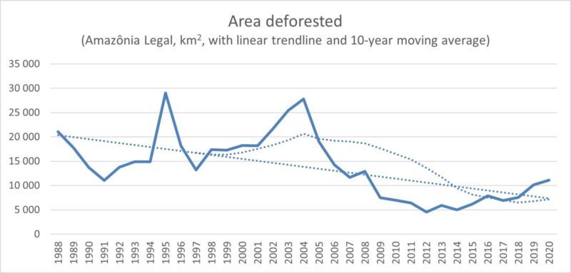
When the scientific journal Nature has a headline that reads “deforestation rate in 2020 is the greatest of the decade,” they’re not lying. The BBC even trumped them a little by slapping “deforestation ‘surges to 12-year high’” on unsuspecting readers. So, we get the impression that Brazilian deforestation is really bad:

Here I overlaid a simple trendline and a ten-year moving average for illustration. The 11,000 km2 deforested last year was indeed the highest since 2008, but is dwarfed by what routinely came before it. More importantly, we must ask: is it a lot? If your target rate of deforestation – in the poorest areas of a relatively poor country, mind you – is zero (which it shouldn’t be), it looks like things are not just terrible but going the wrong way. A longer, and wider, perspective tells you otherwise.
It didn’t take long before BBC’s science editor, David Shukman, brought up the familiar “football field-per minute” metric. The area deforested last year was around 1,552,320 standard British football fields, or over 4,000 of them each day, for just under 3 football fields a minute. While Shukman and countless others have tried to make the topic visually understandable for a layperson – we can imagine the size of three adjacent football fields – our imagination is quickly swamped by a “massively large area that I can’t even grapple with.” Quickly, when we scale those minutes to hours and days, we get the impression that huge areas of this important forest is melting away faster than ice cream on a hot summer’s day.
But we already know that the Amazon forest alone is some 5,500,000 km2 large, the portion within Brazil’s borders some 4,000,000 km2. What was deforested last year, then, was less than 0.003% of the Brazilian forest left standing. Now, does it still sound like an incredibly vast amount? If we estimate that farmers and loggers deforest a similar amount in the next few years, and we ignore potential runaway feedback processes for a minute, Brazilians have enough forest for 360 years. We know enough about economic development and Kuznets curves to know that Brazilians won’t mindlessly deforest the Amazon for that long.
Yet, the picture the reader carries with them is one of runaway deforestation rather than a mild return to longer-term trend.
The world of ice isn’t much better. Here we don’t employ the unhelpful and unscientific metric of football fields per minute, but Olympic swimming pools to gauge the amount of meltwater – or sea meter equivalents to compare amounts of ice (mostly in Antarctica and the Greenland Ice Sheet, or ‘GIS’).
The Guardian, always ready to deliver alarmism, reported that the GIS lost a record 530 billion metric tons of ice in 2019. Again, we’re faced with a number we can’t relate to. Is that a lot? The journalist kindly calculated that it’s about 1 million tons of ice per minute, but that still doesn’t quite cut it – where can I store a million tons of ice? Enter the swimming pools. Think seven of them, in some gigantic swimming facility, filled to the brim with Greenland ice. OK, I can somewhat picture that amount of ice. But then we add seven more pools the next second; and seven more, the next. Quickly we run into the same problem we did with the football fields: this is just a massive amount of ice that’s melting. The images flash before our eyes: an ice-free world, the extra water in the oceans sweeping over our cities and drowning us all, Day After Tomorrow-style.
For some unfathomable reason, the journalists forgot to report how incredibly large the GIS is – not to mention Antarctica at something like 10x its volume. The ice sheet that covers 80% of Greenland is a dome of permanent ice, 1.7 million km2 and some 2-3 km thick at its peak. Comparing it in size to U.S. states, it’s something like the area of Texas, California, New Mexico, Arizona, and Montana combined, covered in kilometers of ice. Estimates put it at 2.85 million cubic kilometers of ice, from which we last year lost about 530 km3. That’s 0.02% of the ice sheet. Unless I displaced a few zeros somewhere – which wouldn’t even change my argument – the GIS has enough ice left to fill more Olympic swimming pools than the dollar values of all the assets in the world (where each dollar’s value represents one Olympic swimming pool of ice). It’s, um, a lot.
A listener to British statistician and economist Tim Harford’s show More or Less wondered about a figure he had heard in the media of 70 meters of sea level rise if all of Antarctica melted. Bethan Davies at University of London helps explain that if all the ice in the West Antarctica, East Antarctica, and Antarctic Peninsula ice sheets were to melt, we’d be looking at something like 58 meters rise in global sea levels. In her defense, Davies quickly dispelled any notions of that happening: zero, nada, zilch. Antarctica’s vast ice sheets probably will contribute to sea level rises over the next century, but nothing like the 50+ meters that scary hypothetical calculations like those conjure up – with walls of ocean water suddenly battering down our coastal lands.
Still, journalists keep talking about a future without ice, about ice-free summers in the Arctic, and casually throwing in “sea level rise if x were to melt completely” as if x was in any danger of melting away entirely over anything but geological time frames. This places the completely wrong ideas in their readers’ heads and gravely misinforms the public about the world.
Doctors abide by the “First, do no harm” promise. Maybe journalists should too.
This article was first published April 22, 2021, by the American Institute for Economic Research, and is republished here by permission. A statistical error in it has been corrected.
Joakim Book is a writer, researcher and editor on all things money, finance and financial history. He holds a masters degree from the University of Oxford and has been a visiting scholar at the American Institute for Economic Research in 2018 and 2019.
His work has been featured in the Financial Times, FT Alphaville, Neue Zürcher Zeitung, Svenska Dagbladet, Zero Hedge, The Property Chronicle and many other outlets. He is a regular contributor and co-founder of the Swedish liberty site Cospaia.se, and a frequent writer at CapX, NotesOnLiberty, and HumanProgress.org.
Featured image by by Liane Metzler on Unsplash


Do you have any articles guesstimating the saturation level from the combined amount of pollutants from factories, coal-powered plants, and automobiles world-wide into our vast atmosphere? Not being a scientist myself (nor having played one on TV), I’m guessing the combined world’s pollution into the Earth’s atmosphere would be less than the affect of a person at one end of an open football stadium (not a domed one) smoking and the person on the opposite end of the same stadium being affected by second-hand smoke…ain’t gonna happen. My simple-minded thought process is that with the vastness of our atmosphere causing pollutants to disperse and dissipate from the air currents how do the nutjob liberals ever expect it to cause a lasting change to our climate if volcanoes and million-acre forest fires do not (other than their marxist scare tactics)? What say you? I told ya I weren’t no scientist.
Global atmospheric concentrations of pollutants in air (surface to top of atmosphere) and waters (surface to bottom in rivers, lakes, oceans) is measured but is not nearly so important as local concentration. As you hint in your question, concentration of cigarette smoke in the atmosphere at large is irrelevant; concentration in the air an individual smoker breathes through his cigarette is highly relevant.
The US EPA compiles data on the concentration of “criteria pollutants” (https://www.epa.gov/criteria-air-pollutants/naaqs-table). Similar agencies do so for most other countries.
It’s not quite accurate to think that our addition of infrared-absorbing (“greenhouse”) gases to the atmosphere cannot have significant effects, and it’s not quite accurate to lump them in with natural emissions from volcanoes, etc. Our emissions, mainly from burning fossil fuels and making cement, etc., have contributed significantly to an increase in global atmospheric CO2 concentration (from about 280 ppm in the late 18th century to about 415 ppm now), and basic physics tells us that as an infrared-absorbing gas becomes more concentrated in the atmosphere, it will absorb and re-radiate (that is, spherically outward) heat traveling from Earth’s surface to space. That should, all other things being equal, contribute to some increase in global average surface temperature (and decrease in high-altitude temperature). The devil, however, is in the details of how all the thousands of feedback mechanisms in the climate system respond to that stimulus—some increasing and others decreasing the warming. Most of the computer climate models are written with assumptions that warming feedbacks predominate, but there are good empirical reasons to think otherwise.
We recommend that you get and read S. Fred Singer’s outstanding book Hot Talk, Cold Science from our online store (https://cornwallalliance.org/product/hot-talk-cold-science-global-warmings-unfinished-debate/) for further study.
I read the article on rainforests and the author has the measurements wrong. The Amazon rainforest is much, much larger than indicated. The author writes that it’s area is 5,500,000 sq m, but it is really 5.5 million km2, or 5.5 trillion sq meters. The same error is made throughout. In other words, the area that is clear cut each year is tiny compared to the size of the forest. Further, some of the area subsequently returns to forest, perhaps as a plantation or sometimes simply because its usefulness in another use is completed.
It is also important to remember that the Amazon rainforest is actually a planted forest, planted by indigenous people hundreds of years ago to supply food throughout the year.
Thank you for the corrections, Kees! We’ll edit accordingly.
I discovered your website after hearing its mention on Answers in Genesis. I am a Bible believing Christian who works in the field of storm drainage engineering. From what I read on your website I believe we are on the same team so please take the following observation as constructive. Ironically you should check your units and numbers being cited with the unit of square meters. An area of 5.5 million square meters is cited, which equates to 5.5 square kilometers (not such a huge area). The area cited for the ice sheet in Greenland as 1.7 million square meters (and 2-3 km thick) is really an area of 1.7 square kilometers. Were you intending to cite these areas as square kilometers? Otherwise I enjoyed the article and commend the spirit of the article.
Thank you for catching those mistakes—as did another reader. We’ll correct for them.
Further correspondence with Dr. G. Cornelis van Kooten of the University of Victoria yields these additional corrections to some statistics in the article:
In the article it says that 11,000 km2 was deforested. There are 5.5 million km2 of rainforest in the Amazon. Therefore, 11000/5,500,000 = 0.002, or 0.2%. Now, if you take only the 4,000,000 km2 of the Amazon that is in Brazil, you get a rate of 11/4000 = 0.00275, or 0.275%, so you are out by a couple of factors.
As to the other issue: Greenland is 2.166 mil km2, so 1.7 mil km2 ice sheet sounds correct, meaning nearly 0.5 mil km2 is not part of the ice sheet. If the ice sheet is 2 to 3 km deep, then the volume of ice is some 3.4 million km3 to 5.1 km3 – a huge volume of ice. So the 2.85 mil km3 value is a bit low, but probably closer to the truth. If 530 km3 is lost, this constitutes 0.000185965 of the total volume, or a volume loss of 0.02%.