A little etymology lesson: data derives from the Latin, dare (pronounced DAH-ray), “to give,” and means “given.” (Back when I took Latin, it was typically the second verb the conjugation of which one learned. The first was amo, “I love,” the infinitive form of which is amare.)
Data means “given.” In the natural sciences, it’s supposed to mean what we observe. It’s supposed to be quite distinct from what we do with or infer from what we observe.
To be data, information should be unadjusted from actual observations. Thus, if I stand on a scale that’s at factory default setting and it registers my weight as 260 lbs., and then I use the little knob at the front to adjust it and get back on it and it registers my weight as 255 lbs., 260 lbs. is data, and 255 lbs. is not. Some people will call it “adjusted data,” but in fact if it’s adjusted it’s not data—it’s information adjusted from data.
Classic scientific method ideally uses data (unadjusted information obtained from observations) to test guesses (or, on an ascending scale of confidence, hypotheses, theories, and laws). As Nobel Prize-winning physicist Richard Feynman put it,
In general we look for a new law by the following process. First we guess it. Then we compute the consequences of the guess to see what would be implied if this law that we guessed is right. Then we compare the result of the computation to nature, with experiment or experience, compare it directly with observation, to see if it works. If it disagrees with experiment it is wrong. In that simple statement is the key to science. It does not make any difference how beautiful your guess is. It does not make any difference how smart you are, who made the guess, or what his name is—if it disagrees with experiment it is wrong. That is all there is to it. [Richard Feynman, The Character of Physical Law (London: British Broadcasting Corporation, 1965), 4, emphasis added.]
Not to be naive, and in recognition that we don’t often achieve what is ideal, we must acknowledge that data sometimes need to be adjusted to make information comparable over time, space, and observational tools and techniques. Mercury thermometers measure temperature differently from microwave sensors on satellites. Instruments’ accuracy changes as they age. Collection locations and times of day may change. Individuals’ skills at using instruments differ. With deep misgivings, we can agree to call the results of such adjustments “data,” but we should always do so while firmly remembering that they are not, strictly speaking, data, not even adjusted data, but information adjusted from data.
Up to a point, adjustments can make information adjusted from data more credible than the original data. If you observed me turning the knob to adjust the reading on my scale downward, and you calculate the number of pounds my action will strip from my apparent weight, your adding those pounds back in make your resulting information about my weight more credible than the reading on my tweaked instrument.
But if we assume that most inaccuracies and incomparabilities of data arise from random errors rather than intentional falsification, we can also assume that the results of those random errors will themselves be random. That is, if you take 30 measurements of the length of an object, and your errors are random, you can be reasonably sure that as many errors will be on the high side as the low, and generally their average will be more credible than any one of them taken singly. Likewise if you’re measuring its weight, or its temperature.
It follows from this that if the difference between the individual units of information adjusted from data consistently shifts the measurements in one direction (upward, downward, heavier, lighter, harder, softer, stronger, weaker, longer, shorter, etc.) rather than randomly, we can be reasonably sure that there was intentional error either in the initial collection of what we now realize are wrongly called data, or in the adjustment process. That is, a clear pattern of adjusting data in one direction or another is evidence of skullduggery somewhere—whether in the initial collection, or in the adjustment process.
That’s where the work of master data sleuth Tony Heller comes in. When it comes to evaluating adjustments to global and regional temperature data, he’s the gold standard. What he does isn’t terribly complicated in principle. It just takes lots of patience and exquisite care with lots of numbers. And the results are bad news for the credibility of lots of official temperature “data” from sources like NASA, NOAA, Hadley, CRU, and others.
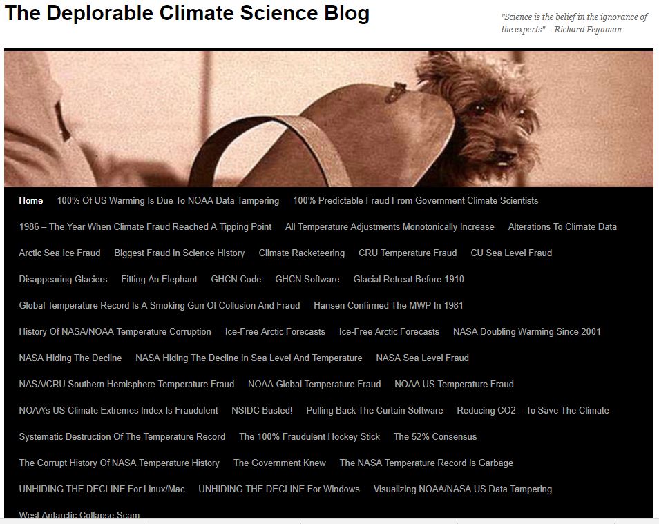
At the top of every page of his The Deplorable Climate Science Blog (deplorable describing not the blog but the climate science) you’ll see this:
Almost every one of those headlines links to a post in which Heller demonstrates, with the simplest of mathematics and the clearest of graphs, that something’s rotten in Denmark—that climate alarists are, over and over again, adjusting data with methods that result in information that’s less credible than the data from which it’s derived.
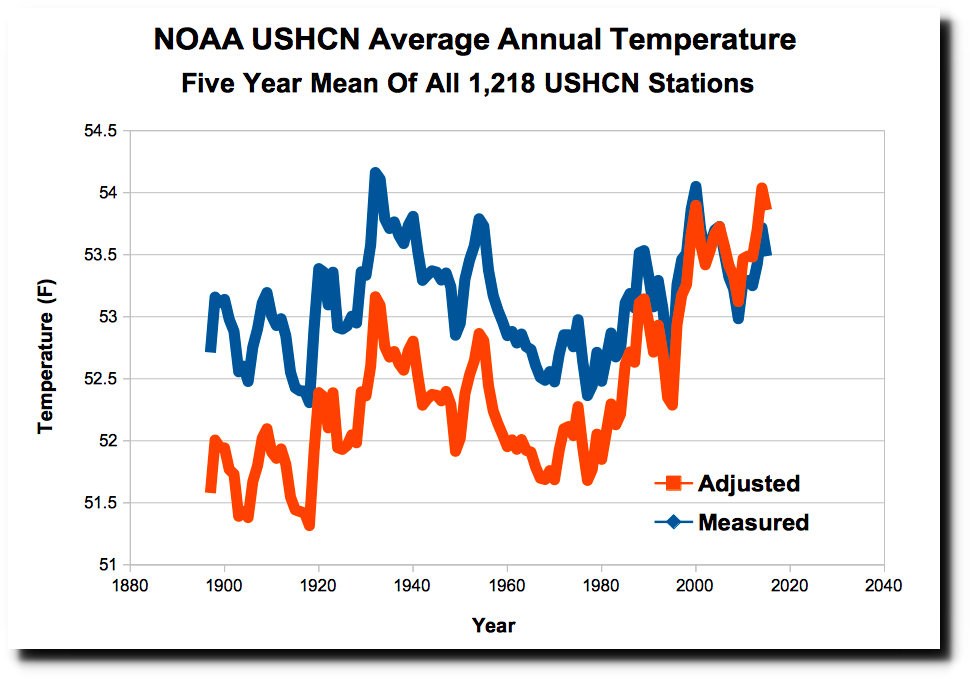
Let me introduce you to just one of his more recent posts, from March 20, “NOAA Data Tampering Approaching 2.5 Degrees.” In it, Heller shows how the National Oceanic and Atmospheric Administration (NOAA) and National Aeronautics and Space Administration (NASA) have adjusted raw U.S. temperature data in ways that raise younger and lower older numbers, creating a fictitious, or at best fictitiously exaggerated, warming trend.
To get the full impact, you should go ahead and read his whole article, but here are a few of the graphs he offers, and if you’re someone who dislikes dishonesty, especially dishonesty paid for by your tax dollars, these should be enough to make your blood boil.
The long-term upward trend in alleged U.S. annual average temperature is almost entirely an artifact of the adustments, which hide the fact that the 1930s were warmer than last two decades.
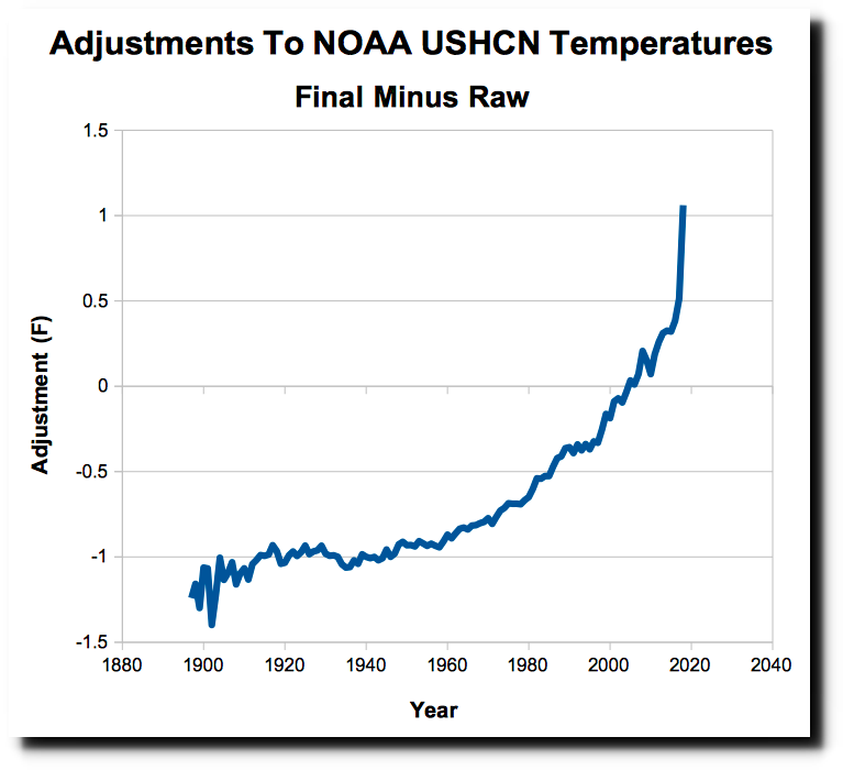
Look at that carefully, attending particularly to the vertical axis. What it shows is that NOAA has adjusted temperature data downward for all the years before shortly after 2000 and upward for the years since. The farther back you go, the more NOAA pushes the “data” downward (“0” on the vertical axis would be where a data point would fall if it hadn’t been adjusted at all, up or down); the more recent you go, the more it pushes the “data” upward. This is a sure sign of skullduggery.
As Heller reports,
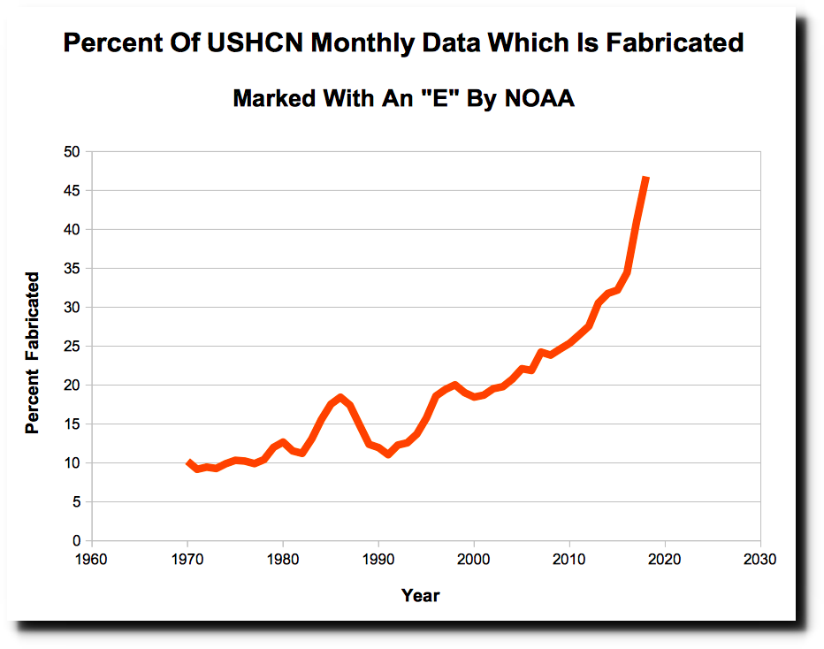
Most of these adjustments are due to simply making up data. Every month, a certain percentage of the 1,218 United States Historical Climatology Network (USHCN) stations fail to report their data, and the temperature gets estimated by NOAA using a computer model. Missing data is marked in the USHCN database with an “E” – meaning “estimated.” In 1970, about 10% of the data was missing, but that number has increased to almost 50%, meaning that almost half of the current adjusted data is fake.
Here’s his record of that growing substitution of fake for real measurements:
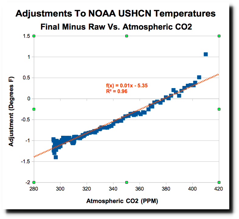
As a coup de grace, Heller then shows that the result of NOAA’s adjustments is to bring U.S. temperature data in line with the theory of CO2-driven global warming. That is, rather than follow Feynman’s dictum that in genuine scientific method observation corrects theory, NOAA uses theory to correct observation. Who are the real “science deniers” now?
But here is the real smoking gun of fraud by NOAA. The adjustments being made almost perfectly match atmospheric CO2 levels – showing that the data is being altered precisely to match global warming theory.
In other words, NOAA knew what it wanted the “data” to say, and when the real (raw, unadjusted) data didn’t say that, it adjusted them till they did. The result has as much credibility as a confession wrung from an accused by torture.
But read the whole of Heller’s article—and then click on the links to his many others showing similar frauds on the part of our offical “data” stewards. Then ask yourself, “And anyone would trust these guys because—why?”



Yeah. Right.