
UAH Principal Research Scientist and Cornwall Alliance Senior Fellow Dr. Roy W. Spencer just posted the monthly UAH satellite temperature update on his blog, and on global average, last month was the warmest March since satellite monitoring began in 1979.
Predictably, climate scaremongers are hailing this as proof positive that our evil emissions of evil carbon dioxide from evil fossil fuels are driving us inexorably (Slate says we’ve “just reached a terrifying milestone”!) toward the tipping point at which climate catastrophe becomes unstoppable. (What good do we get from those evil fossil fuels, anyway? Nuthin’! We oughta stop burning ’em, entirely, today!)
Uh, hold on a minute.
Anybody ever heard of the post hoc fallacy? Despite the Latin, it’s not all that difficult to understand, and I even have memories of its having been discussed as early in my education as third or fourth grade—my teachers would point out that the sun’s rising after the rooster crowed (we lived in a rural area and really heard roosters crow) didn’t mean the rooster’s crowing caused the sun to rise.
So we had a warmer March than any in the last 38 (and maybe 500) years, and over that time we’ve put a lot more CO2 into the atmosphere. Does that mean the added CO2 caused the warmer March? Go talk to a rooster.
Actually, as Spencer pointed out in announcing that February was the warmest February in the satellite record, “The February warmth is likely being dominated by the warm El Nino conditions ….” Likewise, for March he writes, “I suspect that February and March represent peak El Nino warmth in the lower troposphere, and the rest of the year will see cooling. Whether 2016 ends up being a record warm year will depend upon just how fast global temperatures fall as La Nina approaches, now forecast for late summer or early fall.”
In short, it’s not steadily rising CO2 concentration that caused the (what may turn out brief) spike in global average temperature (GAT) but the brief super-El Nino.
Got your doubts? Here’s UAH’s graph for satellite-measured global temperature anomaly 1979–present:
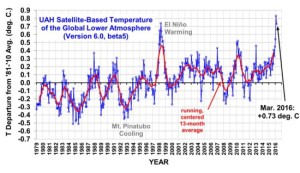
When do the spikes in GAT happen? 1982–1983, 1986–1988, 1991–1992, 1995–1996, a really big one in 1997–1998, 2010-2011, and now 2015–2016. Those spikes are superimposed on a general warming trend over the period some of which may be attributable to the steady rise in CO2 but some of some of which may also be attributable to non-human causes.
Now here’s the portion of NOAA’s graph (which stretches back to 1950) of the Oceanic El Nino Index (the El Nino/La Nina Southern Oscillation) for the same period:
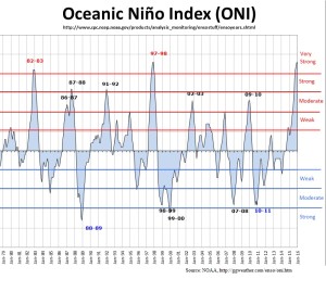
When were the big El Nino years? 1982–1983, 1986–1988, 1991–1992, 1997–1998, 2002–2003, 2009–2010, and now 2015–2016. Aside from the absence of the 2002–2003 moderately strong El Nino year from the satellite GAT spike record, it’s a very good match.
And that’s far more than we can say for the match between climate computer models simulations of GAT increase and real-world observations. As John Christy shows in this graph presented in testimony before the House Committee on Science, Space, & Technology last month, the models simulate a warming rate of about +0.214C per decade, while the observed rate is likely somewhere between +0.079C (weather balloon datasets) and +0.091C (satellite datasets) per decade. I.e., the models call for about 2.4 to 2.7 times the observed warming rate.
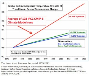
In other words, the observed increase in GAT over the period (taking the average of the satellite and balloon data) has been about 0.323C. The daily range between high and low temperatures, and the seasonal range between high and low temperatures, in many locales around the world is 10 to 100 times that much (or more).
In short: Who cares about such minuscule changes in GAT? Suspicion: Those who stand to gain power (government leaders) or money (renewable energy industrialists) from our fears.


But look at your chart. The La Niña temperature trough recently is as high or higher than the El Niño peak at the beginning of the chart. That indicates a slow steady background warming. What’s causing that? I think we both know the answer.
If CO2 were the PRIMARY driver of the longer-term warming, we would expect a steadier rise over the period. That we don’t see that suggests that, whatever role CO2 might play, it is not the PRIMARY driver (causing “most,” i.e., >50%, of the warming over the period, per the IPCC’s claim in AR5). That similar (indeed probably greater) aggregate increase in GAT happened in the upward trend of the MWP assures us that non-anthropogenic causes sufficient to cause that exist. That means the null hypothesis supports those, not CO2, as the primary driver of the recent warming. In addition, even over the last half century, changes in GAT lead changes in CO2, not follow—the opposite sequence needed by the “consensus” theory. See https://cornwallalliance.org/2012/12/carbon-dioxide-and-air-temperature-who-leads-and-who-follows/.
Calvin, you have a choice. You can use surface temperatures going back 100 years and plot just years with an El Niño, and note the slope. Or, you can exclude El Niño years, and plot only years with no El Ninos.
Guess what? Each graph will show the exact same thing. Rising temperatures. With a warming earth each El Niño seems to set a new record.
Here, NOAA has already done the work.
https://www.ncdc.noaa.gov/sotc/service/global/enso-global-temp-anom/201213.png
Note La Niña years keep getting ware, El Niño years keep getting warmer, and years without either keep getting warmer.
Jim, you’re missing the point and misunderstanding us. We’ve never denied that, over the long term, GAT has risen (since, say, 1850)–we’ve acknowledged that all along. Our argument has been that the comparison between CO2’s quite steady rise and GAT’s intermittent rise suggests that CO2, though it probably does contribute something to the rise, is not the primary driver, and that its contribution is too small to spell be considered disastrous, as well as too small for our reduction of CO2 emissions to make a large difference in future temperature.
Jennifer Marohasy put the point well at https://us8.campaign-archive1.com/?u=15700aee80d95c10a7ba48daa&id=24aec6ce76&e=317fddfa1d when she wrote,
Note the boldfaced part. That’s our point–the point you’ve missed.
Thanks for your reply. But here is the point you miss. No one ever claimed there isn’t natural variability in climate. Of course there is. And it’s that natural variability that keeps temperature from rising in a straight line upward. Clouds, oceans, and yes, even El Ninos and La Ninas. It’s a non-linear system. Contrary to Jennifer infers, AGW never claimed it would create a linear climate system.
What you certainly cannot infer is that man-made CO2 is NOT the primary driver. In fact, the clear preponderance of science claims that the only explanation for the current unprecedented rate of temperature increase is in fact man-made CO2.
But you missed my real point. You stated that the spike in temperatures in Feb. was from the El Niño. Only part of it. And as I stated, it’s a meaningless qualifier as El Niño years only get warmer, as do La Niña years. If you prefer, eliminate El Niño years from consideration. Of course that would mean you have to eliminate 1998. And that ends any thought of a pause.
I might add yes, we are rapidly increasing CO2 into the atmosphere. And even if temperatures aren’t rising linearly, that doesn’t mean they aren’t responding to such rapid increases in CO2. As stated by NASA
“As the Earth moved out of ice ages over the past million years, the global temperature rose a total of 4 to 7 degrees Celsius over about 5,000 years. In the past century alone, the temperature has climbed 0.7 degrees Celsius, roughly ten times faster than the average rate of ice-age-recovery warming.”
A net increase of 7C over 5,000 years would mean a 0.14C/century warming rate over the period as a whole. You quote: “As the Earth moved out of ice ages over the past million years, the global temperature rose a total of 4 to 7 degrees Celsius over about 5,000 years. In the past century alone, the temperature has climbed 0.7 degrees Celsius, roughly ten times faster than the average rate of ice-age-recovery warming.” Three problems with your implicit argument: (1) The net total 7C of warming over the 5,000 years doesn’t mean that the warming rate wasn’t faster than 0.14C/century during that period, and the ice core records show that temperature rose and fell in cycles of varying lengths during those 5,000-year periods just as they’ve done during the past 1,000 and 2,000 years. During the upward spikes, the rate sometimes was multiples of 0.14C/century. (2) Even the IPCC doesn’t claim that CO2 was the primary driver of pre-1960s warming, yet some of the upward-spiking periods between 1850 an 1960 the slope and duration were roughly equal to the slope and duration of any of the spikes post-1960. If such rates of increase could have been entirely natural pre-1960, they could easily have been largely, and might to our surprise have been entirely, natural post-1960. (3) The 0.214C/decade aveage CMIP5 model prediction of warming based on their underlying theory of anthropogenic CO2-driven warming remains 2.4 to 2.7 times the observed rate over the period, which means the models “run hot,” exaggerating the warming effect of the added CO2. Implication? Therefore the underlying theory is wrong and needs significant correction–correction that implies significantly reduced predictions of warming, of all effects of the warming, and therefore of all effects of efforts to reduce the warming. The implication of that? The benefit/cost ratio of all efforts to reduce the warming is significantly lower than that assumed by their advocates.
A net increase of 7C over 5,000 years would mean a 0.14C/century warming rate over the period as a whole. There are three problems with your implicit argument from your quote: (1) The net total 7C of warming over the 5,000 years doesn’t mean that the warming rate wasn’t faster than 0.14C/century during that period, and the ice core records show that temperature rose and fell in cycles of varying lengths during those 5,000-year periods just as they’ve done during the past 1,000 and 2,000 years. During the upward spikes, the rate sometimes was multiples of 0.14C/century. (2) Even the IPCC doesn’t claim that CO2 was the primary driver of pre-1960s warming, yet some of the upward-spiking periods between 1850 an 1960 the slope and duration were roughly equal to the slope and duration of any of the spikes post-1960. If such rates of increase could have been entirely natural pre-1960, they could easily have been largely, and might to our surprise have been entirely, natural post-1960. (3) The 0.214C/decade aveage CMIP5 model prediction of warming based on their underlying theory of anthropogenic CO2-driven warming remains 2.4 to 2.7 times the observed rate over the period, which means the models “run hot,” exaggerating the warming effect of the added CO2. Implication? Therefore the underlying theory is wrong and needs significant correction–correction that implies significantly reduced predictions of warming, of all effects of the warming, and therefore of all effects of efforts to reduce the warming. The implication of that? The benefit/cost ratio of all efforts to reduce the warming is significantly lower than that assumed by their advocates.