This is the second of a series of articles in which Cornwall Alliance board member and senior fellow Dr. Roy W. Spencer explains the importance of distinguishing urban heat island effect from global temperature increase and of recognizing that by choosing to live in warmer regions of the world and in cities rather than in cooler and rural or wilderness areas, people demonstrate their preference for warmer temperatures. You can find the first article here.
As a follow-on to our paper submitted on a new method for calculating the multi-station average urban heat island (UHI) effect on air temperature, I’ve extended that initial U.S.-based study of summertime UHI effects to global land areas in all seasons and produced a global gridded dataset, currently covering the period 1800 to 2023 (every 10 years from 1800 to 1950, then yearly after 1950).
It is based upon over 13 million station-pair measurements of inter-station differences in GHCN station temperatures and population density over the period 1880-2023. I’ve computed the average UHI warming as a function of population density in seven latitude bands and four seasons in each latitude band. “Temperature” here is based upon the GHCN dataset monthly Tavg near-surface air temperature data (the average of daily Tmax and Tmin). I used the “adjusted” (homogenized, not “raw”) GHCN data because the UHI effect (curiously) is usually stronger in the adjusted data.
Since UHI effects on air temperature are mostly at night, the results I get using Tavg will overestimate the UHI effect on daily high temperatures and underestimate the effect on daily low temperatures.
This then allows me to apply the GHCN-vs-population density relationships to global historical grids of population density (which extend back many centuries) for every month and every year since as early as I choose. The monthly resolution is meant to capture the seasonal effects on UHI (typically stronger in summer than winter). Since the population density dataset time resolution is every ten years (if I start in, say, 1800) and then it is yearly starting in 1950, I have produced the UHI dataset with the same yearly time resolution.
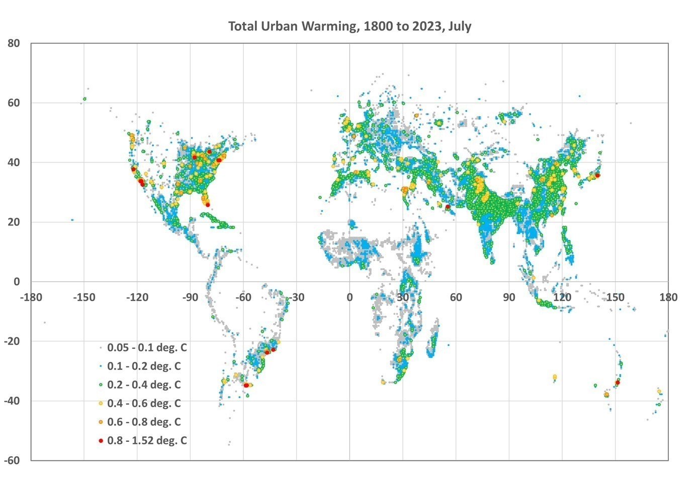
As an example of what one can do with the data, here is a global plot of the difference in July UHI warming between 1800 and 2023, where I have averaged the 1/12 deg spatial resolution data to 1/2 deg resolution for ease of plotting in Excel (I do not have a GIS system):

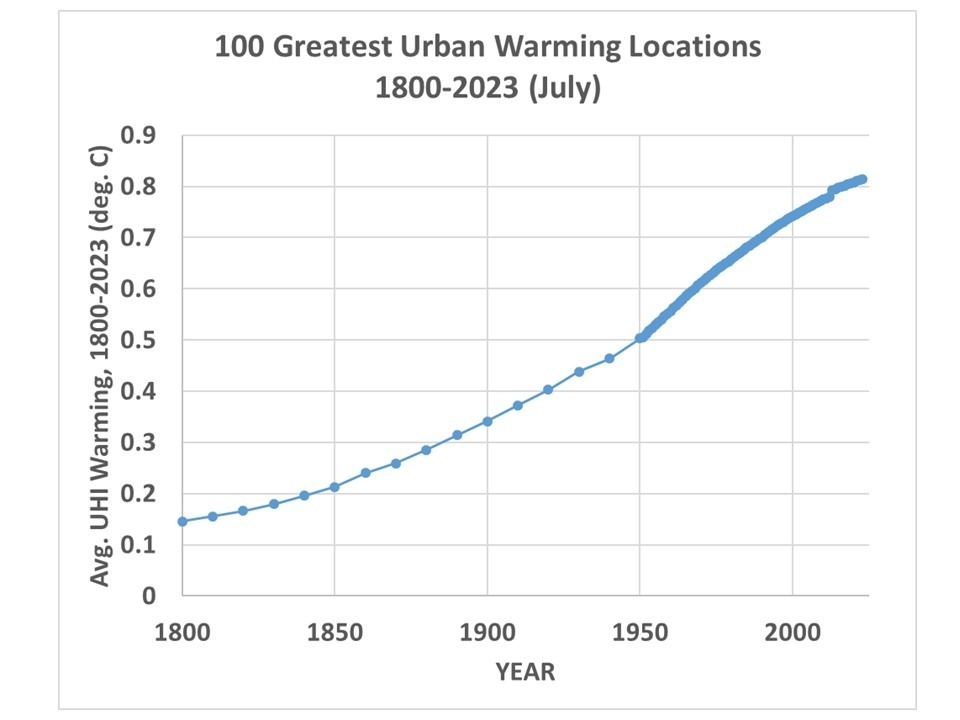
If I take the 100 locations with the largest amount of UHI warming between 1800 and 2023 and average their UHI temperatures together, I get the following:

Note that by 1800 there was 0.15 deg. C of average warming across these 100 cities since some of them are very old and already had large population densities by 1800. Also, these 100 “locations” are after averaging 1/12 deg. to 1/2 degree resolution, so each location is an average of 36 original resolution gridpoints. My point is that these are *large* heavily-urbanized locations, and the temperature signals would be stronger if I had used the 100 greatest UHI locations at original resolution.
Again, to summarize, these UHI estimates are not based upon temperature information specific to the year in question, but upon population density information for that year. The temperature information, which is spatial (differences between nearby stations), comes from global GHCN station data between 1880 and 2023. I then apply the GHCN-derived spatial relationships between population density and air temperature during 1880-2023 to those population density estimates in any year. The monthly time resolution is to capture the average seasonal variation in the UHI effect in the GHCN data (typically stronger in summer than winter); the population data does not have monthly time resolution.
In most latitude bands and seasons, the relationship is strongly nonlinear, so the UHI effect does not scale linearly with population density. The UHI effect increases rather rapidly with population above wilderness conditions, then much more slowly in urban conditions.
It must be remembered that these gridpoint estimates are based upon the average statistical relationships derived across thousands of stations in latitude bands; it is unknown how accurate they are for specific cities and towns. I don’t know yet how finely I can regionalize these regression-based estimates of the UHI effect, it requires a large number (many thousands) of station pairs to get good statistical signals. I can do the U.S. separately since it has so many stations, but I did not do that here. For now, we will see how the seven latitude bands work.
I’m making the dataset publicly available since there is too much data for me to investigate by myself. One could, for example, examine the growth over time of the UHI effect in specific metro regions, such as Houston, and compare that to NOAA’s actual temperature measurements in Houston, to get an estimate of how much of the reported warming trend is due to the UHI effect. But you would have to download my data files (which are rather large, about 117 MB for a single month and year, a total of 125 GB of data for all years and months). You can find the file here.
You will be able to identify them by name.
The format is ASCII grid and is exactly the same as the HYDE version 3.3 population density files (available here) I used (ArcGIS format). Each file has six header records, then a grid of real numbers with dimension 4320 x 2160 (longitude x latitude, at 1/12 deg. resolution).
Time for Willis to get to work.
This piece originally appeared at DrRoySpencer.com and has been republished here with permission.


Pingback: AWED MEDIA BALANCED NEWS: We cover COVID to Climate, as well as Energy to Elections. - Dr. Rich Swier
Pingback: Neue Studie eingereicht: Auswirkungen der städtischen Wärmeinsel auf die Sommertemperaturen in den USA, 1880-2015 | EIKE - Europäisches Institut für Klima & Energie
Pingback: Examples from our New UAH Urban Heat Island Dataset
Then, how is it that the greatest warming has been observed in the Arctic where urban areas do not exist at all? https://climate.nasa.gov/news/2945/nasa-noaa-analyses-reveal-2019-second-warmest-year-on-record/