Someone recently wrote to us, “Wondering if you can help me with this? I’ve gotten myself into a friendly debate with a family member on climate change and he sent me this infographic. His argument is that combustion engines are bad for the environment and causing things like fires to happen. What would be a good rebuttal to this?”
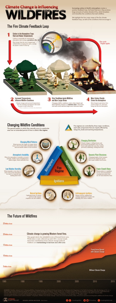
Here’s the infographic:

So, how to respond?
The number of problems in that graphic is amazing. Here are some quick points:
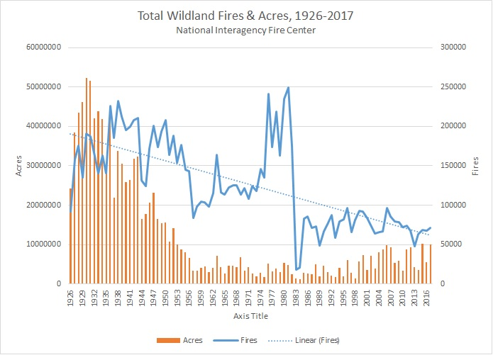
Mark Twain said there are “lies, damned lies, and statistics.” The graph of wildfire acreage burned falls in all three categories. The graph covers the years 1985–2015. Looks like a devastating increase. But it’s a case of cherry-picking data, specifically, of end-point fallacy: picking only that period that fits your narrative. Here’s a longer sweep:

You can see what the authors did: they picked the lowest year and started there, knowing that of course that would yield an upward curve. But if they’d gone back as far as the data go, they’d have had to reveal that the number of fires and area burned were several times higher in the 1920s than in the 2010s.
They commit the fallacy of non causa pro causa, treating something that isn’t the cause of the phenomenon they have in mind as if it were. They just assume that climate change has caused the (post-1985) increase in area burned by wildfires. But the higher numbers and extents of fires long before the “climate change” show that the problem can exist without that assumed cause—which means the problem in the later period need not be blamed on climate change. Is there something else that could cause it? Yes, and understanding why the number and extent of fires fell so dramatically from the 1920s through the 1980s points us toward that cause. The decline occurred because we began carefully managing forests—harvesting trees for lumber, removing excess undergrowth that previously fueled extremely hot and rapidly spreading fires, using controlled burns to limit such undergrowth, and creating fire breaks (wide paths of bare ground) that keep fires from spreading. Okay, so that’s what drove numbers and extents of fires down over that period. Why did they rebound (somewhat) from the mid-1980s on? Not because of any change in temperature or precipitation—the increase in global average temperature over the period is far too slight to have any effect on combustion, and there has been no significant long-term change in precipitation in the affected areas—but because, at the urging of environmentalists who reject the notion of human dominion over/management of the natural environment, we largely stopped those forest management techniques starting in the 1970s, and by the late 1980s the consequences of the buildup of undergrowth and loss of fire breaks began to manifest. To learn more about this, see https://cornwallalliance.org/product/fix-americas-forests-reforms-to-restore-national-forests-and-tackle-the-wildfire-crisis/.
They report only on the negative consequences of the activities that emit CO2, ignoring the benefits. Without even questioning, for now, the reality of those negative consequences, we can already say that such reporting is biased and irrational. Simple illustration: Your wife goes to the grocery store and pays $250 (negative consequence of your action), and you chastise her for losing all that money while ignoring all the groceries (positive consequence of your action). Are you being fair?
Okay, so: sure, burning fossil fuels and making concrete and various other activities add CO2 to the atmosphere, and that additional CO2 raises global average surface temperature (by how much is a different subject; see below). But burning those fossil fuels also: warms and cools and lights our homes and offices and hospitals, powers our vehicles and farm machines and factories and hospitals and schools, and as a byproduct of petroleum refining gives us over 10,000 products that are ubiquitous in our lives, like the MRI machine I lay in this morning and practically every medical device you can imagine, not to mention all the other plastics and artificial fabrics we use, and fertilizers, and pesticides, and herbicides, and fungicides, all of which improve crop yield, making food less costly. If the authors of this graphic were being honest, they’d mention not just the (supposed) negatives but also the (unquestionable) positives.
And that’s just looking at the direct benefits of burning fossil fuels. There’s also the indirect benefit of added CO2 in the atmosphere. (They present this as if added CO2 has no benefits, only harms. There’s that bias again.) What is that? Increased atmospheric CO2 causes plants to grow better. On average, for every doubling of CO2 concentration, plant growth efficiency increases by 35%; they grow better in warmer and cooler temperatures and in wetter and drier soils; they make better use of soil nutrients; so they expand their ranges; they resist diseases and pests better; they improve their fruit-to-fiber ratio; the result is more food for everything that eats plants (or eats something that eats plants); food becomes less costly; the poor benefit the most. A study from the Center for the Study of Carbon Dioxide and Global Change published in 2013 estimated that this effect of increased CO2 from 1960 through 2012 added $3.2 trillion in crop yields over the period and that the increased CO2 projected through 2050 would add another $9.8 trillion.
And then there’s the problem that they also focus only on the negative consequences of warming. But there are positive consequences, too—and they arguably outweigh the negative consequences. According to the computer climate models on which the UN Intergovernmental Panel on Climate Change depends, greenhouse gas-driven warming occurs primarily toward the poles, primarily in winter, and primarily at night—and less and less as you approach the equator, and in the summer months, and in the daytime. I.e., it raises cold temperatures while leaving hot temperatures largely unchanged. That, too, leads to expanded growth regions for plants. It also leads to longer growing seasons (earlier last freeze, later first freeze) and leads to fewer and less intense cold snaps—which, on average, kill about 20 times as many people as heat waves. That’s all to the good.
The graphic’s authors also write in generalizations, which allows people’s imagines to run wild with fearsome scenarios. E.g., they write, “Heat energy from the sun is trapped and withheld from escaping into space, causing the planet’s surface to heat up.” Okay, sure, but by how much? Well, every greenhouse gas’s warming effect is logarithmic. That means the effect of the first 10 parts per million added to the atmosphere is greater than of the next 10, which is greater than the next, and so on. Why? Because every greenhouse gas, including CO2, absorbs heat (infrared radiation) only within certain bandwidths. As the radiation in those bandwidths gets absorbed, there’s less of it remaining to be absorbed, and at various levels of concentration of the various gases, all the radiation in a given bandwidth has been absorbed, which means you can then add however much of that given gas to the atmosphere and not cause any warming at all. Now I’ll stop writing in broad generalities and give some specifics. Pretty basic physics tells us that doubling CO2 concentration in the atmosphere will, by itself, raise global average surface temperature by about 1 to 1.2 degrees C. That change causes other changes (feedbacks) that might increase or diminish it. The best estimates—estimates constrained by empirical observation rather than driven by modeling alone—of the warming effect of doubling atmospheric CO2 concentration range from about 0.5 to 1.8 degrees C. The graphic recognizes positive feedbacks (which increase the direct warming); it doesn’t mention negative feedbacks (which reduce it). The assumption that the climate system is dominated by positive feedbacks, resulting in a “positive feedback loop.” But if positive feedbacks dominated, any increase in temperature in the past would have continued uninterrupted, and the Earth would already be too hot for life; or, alternatively, any decrease in temperature in the past would have continued uninterrupted, and the Earth would already be too cold for life. That it hasn’t done either shows that the climate system, like every natural system, is dominated not by positive feedbacks (and hence positive feedback loops) but by negative feedbacks, which keep changes from multiplying to catastrophic results.
So, there’s just the beginning of a critique. More could be said, but this much already shows how misleading the infographic is.


Pingback: Following Truth in a Warming World: Correcting One Evangelical’s Errant Views on Climate Change